
TD - The Simpson’s paradox
Eric Koncina, Aurélien Ginolhac
2018-12-05
1 The UCBAdmissions dataset
The UCBAdmissions dataset (which is natively present in R) contains the number of applicants to the graduate school at Berkeley for the six largest departments in fall 1973 (Bickel, Hammel, and O’connell 1975). The data is classified by admission and sex.
The UCBAdmissions dataset is a 3-dimensional array.
- Coerce
UCBAdmissionsto atibble.
solution
UCBA <- as_tibble(UCBAdmissions)## # A tibble: 24 x 4
## Admit Gender Dept n
## <chr> <chr> <chr> <dbl>
## 1 Admitted Male A 512
## 2 Rejected Male A 313
## 3 Admitted Female A 89
## 4 Rejected Female A 19
## 5 Admitted Male B 353
## 6 Rejected Male B 207
## 7 Admitted Female B 17
## 8 Rejected Female B 8
## 9 Admitted Male C 120
## 10 Rejected Male C 205
## # … with 14 more rows- In order to determine whether there was a discrimination against women during the graduate admissions, which statistical test would you use?
solution
2 Overall analysis
2.1 Contingency table
First, we would like to organise this dataset in order to visualise the overall admittance to UC Berkeley for males and females.
- Count the number of admissions and rejections for both genders.
solution
group_by(UCBA, Gender, Admit) %>%
  summarise(n = sum(n))
## # A tibble: 4 x 3
## # Groups: Gender [2]
## Gender Admit n
## <chr> <chr> <dbl>
## 1 Female Admitted 557
## 2 Female Rejected 1278
## 3 Male Admitted 1198
## 4 Male Rejected 1493# Or showing it as a contingency table
group_by(UCBA, Gender, Admit) %>%
summarise(n = sum(n)) %>%
spread(Gender, n)## # A tibble: 2 x 3
## Admit Female Male
## <chr> <dbl> <dbl>
## 1 Admitted 557 1198
## 2 Rejected 1278 14932.2 Proportion table
- To render a better overview, instead of the number of occurrences, calculate the proportion of admission for each gender.
solution
group_by(UCBA, Gender, Admit) %>%
  summarise(count = sum(n)) %>%
  mutate(prop = count / sum(count))
## # A tibble: 4 x 4
## # Groups: Gender [2]
## Gender Admit count prop
## <chr> <chr> <dbl> <dbl>
## 1 Female Admitted 557 0.304
## 2 Female Rejected 1278 0.696
## 3 Male Admitted 1198 0.445
## 4 Male Rejected 1493 0.5552.3 Graphical representations
We would like to visualise the data.
- Use
geom_col()to represent the data as distinct columns. Use different facets to draw the counts and the proportions on the same plot.
Tip
solution
group_by(UCBA, Gender, Admit) %>%
  summarise(count = sum(n)) %>%
  mutate(prop = count / sum(count)) %>%
  gather(method, value, count, prop) %>%
  ggplot(aes(x = Gender, y = value, fill = Admit)) +
  geom_col(position = "dodge") +
  facet_wrap(~ method, scales = "free") +
  labs(y = "Number or proportion of applicants",
       title = "UC Berkeley graduate applications")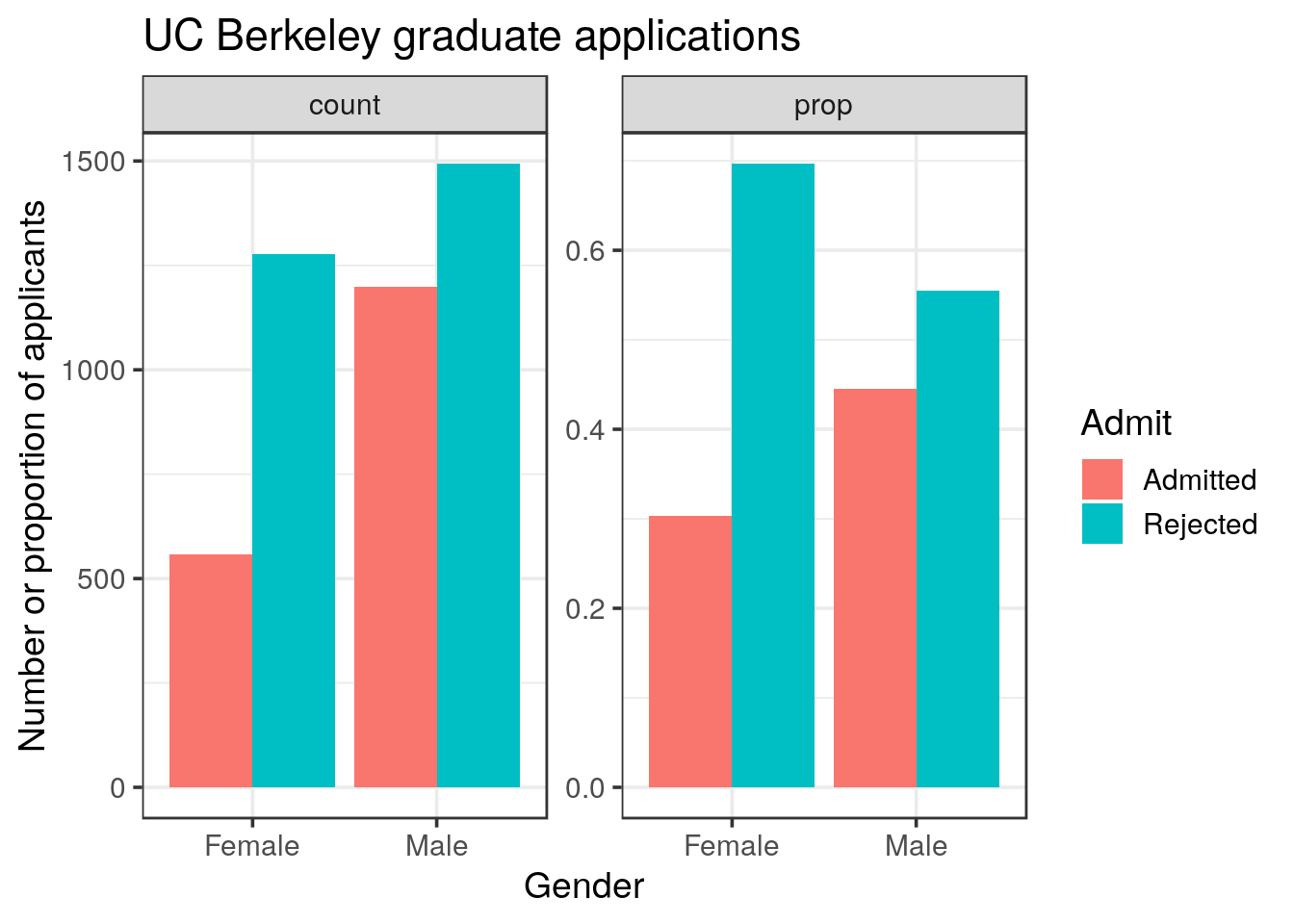
- Try to adjust the
positionargument ofgeom_colto see the difference,stackorfilloptions
solution
p <- group_by(UCBA, Gender, Admit) %>%
  summarise(count = sum(n)) %>%
  mutate(prop = count / sum(count)) %>%
  gather(method, value, count, prop) %>%
  ggplot(aes(x = Gender, y = value, fill = Admit)) +
  facet_wrap(~ method, scales = "free")

p +
  geom_col(position = "stack")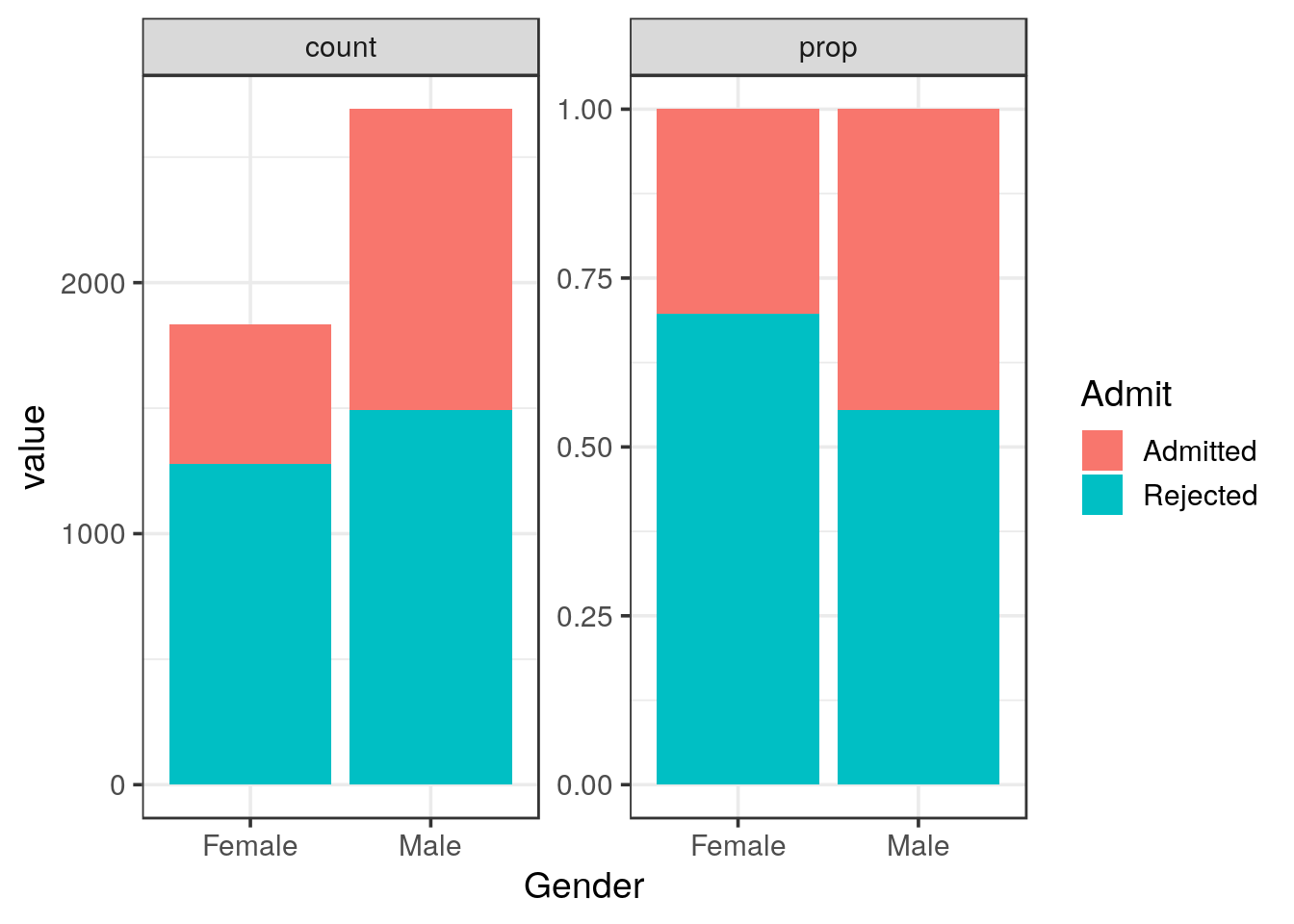
p +
  geom_col(position = "fill")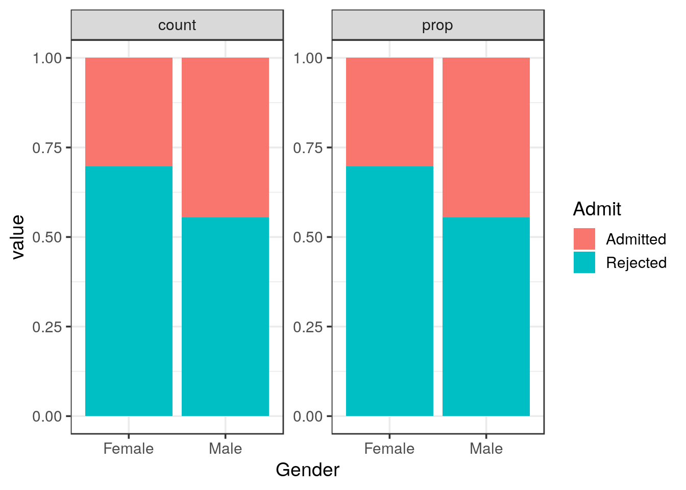
- Based on the tables and graphical representations what would you conclude?
solution
2.4 Statistical analysis
To perform the \(\chi^2\) test, we will use the chisq.test() implemented in R.
Tip
chisq.test() help page to see how to perform the test. Notice that there are different ways to supply the data to the function.
The help page states that chisq.test() accepts a matrix. In addition, in the details, we can read that if x is a matrix, it is considered as a 2D contingency table.
First, let’s try whether formatting a data frame like a contingency table is suitable as an argument (x) to the chisq.test() function.
- Use the count data (you generated before) to create a contingency table (one categorical variable as column names, the remaining one in a column).
solution
group_by(UCBA, Gender, Admit) %>%
  summarise(count = sum(n)) %>%
  spread(Gender, count)
## # A tibble: 2 x 3
## Admit Female Male
## <chr> <dbl> <dbl>
## 1 Admitted 557 1198
## 2 Rejected 1278 1493chisq.test() expects a matrix. Take care to retain only the numeric columns before supplying your data frame to the function.
solution
group_by(UCBA, Gender, Admit) %>%
  summarise(count = sum(n)) %>%
  spread(Gender, count) %>%
  select(Female, Male) %>%
  chisq.test(correct = FALSE)
##
## Pearson's Chi-squared test
##
## data: .
## X-squared = 92.205, df = 1, p-value < 2.2e-16The stats package in base R provides the function xtabs() to generate contingency tables that can be further used in the chisq.test() function.
xtabs()expects a formula. Construct the formula as usual: the response on the left hand side and the factor on the right hand side.- Generate the contigency table using the formula and
xtabs()
solution
xtabs(n ~ Admit + Gender, data = UCBA)## Gender
## Admit Female Male
## Admitted 557 1198
## Rejected 1278 1493- Perform the \(\chi^2\) test again using this contigency table.
solution
xtabs(n ~ Admit + Gender, data = UCBA) %>%
  chisq.test(correct = FALSE)
##
## Pearson's Chi-squared test
##
## data: .
## X-squared = 92.205, df = 1, p-value < 2.2e-16# We obtain the same Chi-squared as before: both methods are suitable.
# An alternative, is to call summary that recognises
# the table format and reports the associated chi-square test
xtabs(n ~ Admit + Gender, data = UCBA) %>%
summary(correct = FALSE)## Call: xtabs(formula = n ~ Admit + Gender, data = UCBA)
## Number of cases in table: 4526
## Number of factors: 2
## Test for independence of all factors:
## Chisq = 92.21, df = 1, p-value = 7.814e-22# the p-value is rounded in the chiq.test but identical when reported as such
xtabs(n ~ Admit + Gender, data = UCBA) %>%
chisq.test(correct = FALSE) %>%
broom::tidy()## # A tibble: 1 x 4
## statistic p.value parameter method
## <dbl> <dbl> <int> <chr>
## 1 92.2 7.81e-22 1 Pearson's Chi-squared test- What is your conclusion?
solution
3 In-depth analysis
Now we would like to determine whether the overall acceptance trend is representative of each single department.
3.1 Graphical representations
- First, similar to your previous representations, show the frequencies and proportions for each of the 6 departments.
Tip
ggplot2 will assign red to Admitted.You might want to change this behaviour with either reordering the levels or changing the color scale (
scale_fill_manual())
solution
my_colors <- RColorBrewer::brewer.pal(3, "Set1")[c(3, 1)]

UCBA %>%
  mutate(Dept = paste("Dept", Dept)) %>%
  ggplot() +
  geom_col(aes(x = Gender, y = n, fill = Admit), position = "stack") +
  facet_grid(~ Dept) +
  labs(y = "Number of applicants",
       title = "UC Berkeley graduate applications") +
  scale_fill_manual(values = my_colors) +
  theme(axis.text.x = element_text(angle = 45, hjust = 1))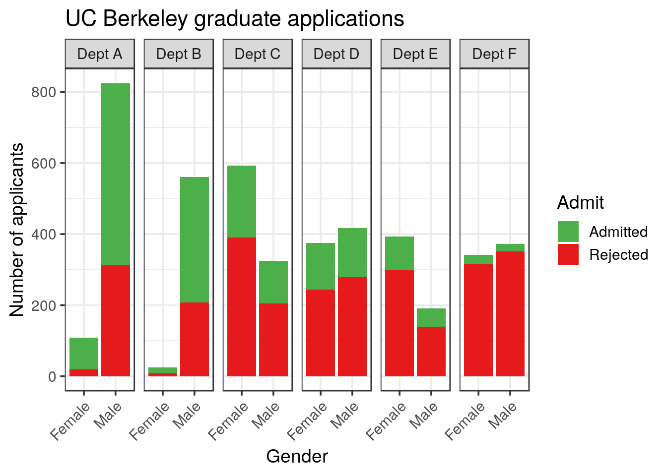
UCBA %>%
  mutate(Dept = paste("Dept", Dept)) %>%
  ggplot() +
  geom_col(aes(x = Gender, y = n, fill = Admit), position = "fill") +
  facet_grid(~ Dept) +
  labs(y = "Proportion of applicants",
       title = "UC Berkeley graduate applications") +
  scale_fill_manual(values = my_colors) +
  theme(axis.text.x = element_text(angle = 45, hjust = 1))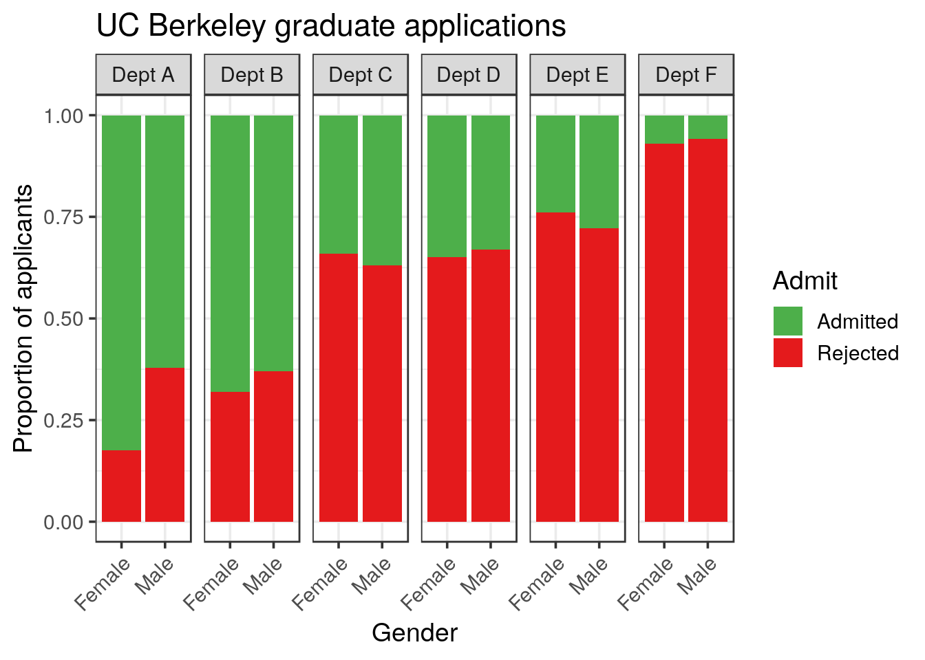
Note that again, we don’t need to compute the proportion, position = "fill" is doing it for us.
3.2 Statistical analysis
Now, perform the appropriate statistical test on the data for each single department.
Adjust the method you just used to perform the statistical test using purrr in order to run it for each department.
solution
library(broom)
UCBA %>%
  group_by(Dept) %>%
  nest() %>%
  mutate(contingency = map(data, ~xtabs(n ~ Admit + Gender, data = .x)),
         chisq = map(contingency, chisq.test, correct = FALSE),
         tidy = map(chisq, tidy)) %>%
  unnest(tidy, .drop = TRUE)
## # A tibble: 6 x 5
## Dept statistic p.value parameter method
## <chr> <dbl> <dbl> <int> <chr>
## 1 A 17.2 0.0000328 1 Pearson's Chi-squared test
## 2 B 0.254 0.614 1 Pearson's Chi-squared test
## 3 C 0.754 0.385 1 Pearson's Chi-squared test
## 4 D 0.298 0.585 1 Pearson's Chi-squared test
## 5 E 1.00 0.317 1 Pearson's Chi-squared test
## 6 F 0.384 0.535 1 Pearson's Chi-squared testBased on the representations and statistical tests, what is your conclusion?
solution
When looking at each department, the picture is by far different. The only statistical difference is observed in the Department A, and is in favor to females.
The different conclusions (ungrouped vs grouped) prove that another bias is present in the data and must be related to the preference for females to apply to specific departments.
3.3 Explaining the apparent discrepancy
This apparent discrepancy is known as the Simpson’s paradox. How can we try to explain it?
- Visualise the success rate (gender independent) for each department
solution
UCBA %>%
  group_by(Dept, Admit) %>%
  summarise(Freq = sum(n))
## # A tibble: 12 x 3
## # Groups: Dept [6]
## Dept Admit Freq
## <chr> <chr> <dbl>
## 1 A Admitted 601
## 2 A Rejected 332
## 3 B Admitted 370
## 4 B Rejected 215
## 5 C Admitted 322
## 6 C Rejected 596
## 7 D Admitted 269
## 8 D Rejected 523
## 9 E Admitted 147
## 10 E Rejected 437
## 11 F Admitted 46
## 12 F Rejected 668solution
UCBA %>%
  group_by(Dept, Admit) %>%
  summarise(Freq = sum(n)) %>%
  ggplot() +
  geom_col(aes(x = Dept, y = Freq, fill = Admit), position = "Fill") +
  scale_fill_manual(values = my_colors) +
  labs(x = "Department",
       y = "Proportion",
       title = "Department's success rate")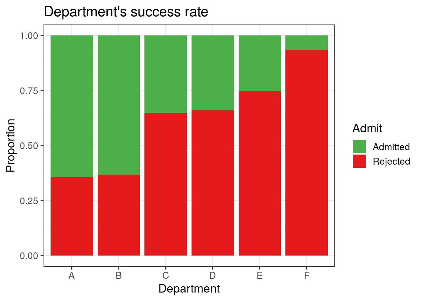
- Visualise the gender preference for the applications to each department
solution
UCBA %>%
  group_by(Dept, Gender) %>%
  summarise(Freq = sum(n)) %>%
  ggplot() +
  geom_col(aes(x = Dept, y = Freq, fill = Gender), position = "Fill") +
  labs(x = "Department",
       y = "Proportion",
       title = "Department's gender preference")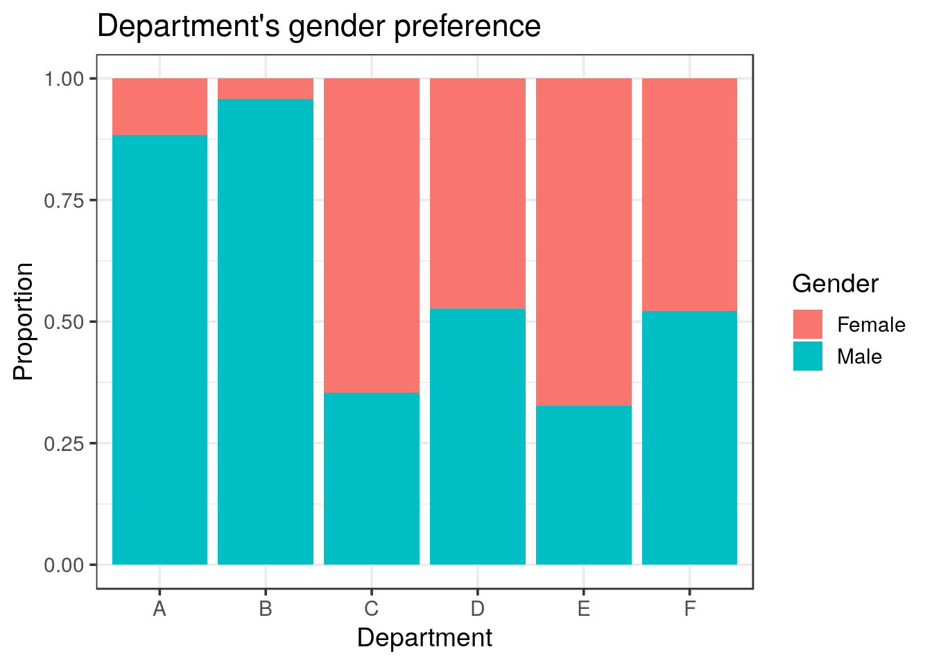
Finally, try to visualise a possible correlation between the women’s application preference and the success rate for the 6 departments:
- compute the preference as the number of applications per Department and Gender
- compute the frequency of each number of applications compare to all applications
- filter for the women frequencies, saved as
women_pref
Tip
group_by() instruction on the two key parameters used to calculate the success rate: Dept and Admit. Then, the summarise() function returns \(6 \times 2 = 12\) lines (6 levels for Dept and 2 for Admit).It is also very important to recall that
summarise() also peels off one grouping from the right. Afterwards, we can use mutate() to compute the proportions since the data is grouped only by Depth at this stage. The same is done for the women’s preference, except that the grouping key variables are Dept and Gender.
solution
women_pref <- UCBA %>%
  group_by(Dept, Gender) %>%
  summarise(n_applications = sum(n)) %>%
  mutate(pref = n_applications / sum(n_applications)) %>%
  filter(Gender == "Female") %>%
select(Dept, pref)- compute the sucess rate for each department
- join the
women_preftibble: you will end up with a tibble showing for each department the success rate together with the women’s application preference.
solution
UCBA_merge <- UCBA %>%
  group_by(Dept, Admit) %>%
  summarise(total = sum(n)) %>%
  mutate(adm = total / sum(total)) %>%
  filter(Admit == "Admitted") %>%
  select(Dept, adm) %>%
  inner_join(women_pref)
# look at merged dataframes.
UCBA_merge
## # A tibble: 6 x 3
## # Groups: Dept [6]
## Dept adm pref
## <chr> <dbl> <dbl>
## 1 A 0.644 0.116
## 2 B 0.632 0.0427
## 3 C 0.351 0.646
## 4 D 0.340 0.473
## 5 E 0.252 0.673
## 6 F 0.0644 0.478- plot the women’s preference in function of the success rate.
solution
UCBA_merge  %>%
  ggplot(aes(x = adm, y = pref)) +
  geom_point() +
  geom_smooth(method = "lm") +
  labs(x = "Proportion of success",
       y = "Women proportion (application preference)",
       subtitle = "Correlation between the women's choice of department and the department's success rate")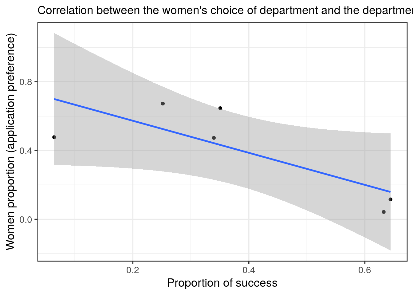
solution
inner_join() which binds the columns according to the common column(s), here: Dept. Finally, we plot the women preference in function of the success rate and even plot the linear regression. The two variables are anti-correlated.
- test how much the observed trend is supported.
solution
cor.test(~ pref + adm, data = UCBA_merge)##
## Pearson's product-moment correlation
##
## data: pref and adm
## t = -2.541, df = 4, p-value = 0.06391
## alternative hypothesis: true correlation is not equal to 0
## 95 percent confidence interval:
## -0.9753531 0.0711263
## sample estimates:
## cor
## -0.7857936solution
# just for the fun of it, we can do a bit of p-hacking by looking at a quadratic regression
UCBA_merge  %>%
  ggplot(aes(x = adm, y = pref)) +
  geom_point() +
  #geom_smooth(method = "lm", formula = y ~ splines::ns(x, 2))
  geom_smooth(method = "lm", formula = y ~ poly(x, 2))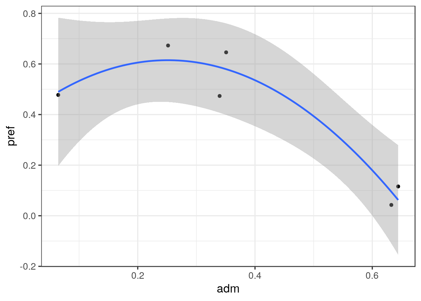
lm(pref ~ poly(adm, 2), data = UCBA_merge) %>% summary()##
## Call:
## lm(formula = pref ~ poly(adm, 2), data = UCBA_merge)
##
## Residuals:
## 1 2 3 4 5 6
## 0.05330 -0.05208 0.06650 -0.11346 0.05806 -0.01232
##
## Coefficients:
## Estimate Std. Error t value Pr(>|t|)
## (Intercept) 0.40475 0.03828 10.574 0.00181 **
## poly(adm, 2)1 -0.46800 0.09376 -4.992 0.01546 *
## poly(adm, 2)2 -0.33063 0.09376 -3.527 0.03874 *
## ---
## Signif. codes: 0 '***' 0.001 '**' 0.01 '*' 0.05 '.' 0.1 ' ' 1
##
## Residual standard error: 0.09376 on 3 degrees of freedom
## Multiple R-squared: 0.9257, Adjusted R-squared: 0.8761
## F-statistic: 18.68 on 2 and 3 DF, p-value: 0.02027# then we go from 0.06391 to 0.02027 and success to p-hack < 0.05!
# anyway, we do see the trend that women apply more to elective departments- What is your final conclusion?
solution
When performing a correlation test we can observe that it is close be significant (p = 0.064). We don’t have enough data points to assess the relationship and we stick to the observed tendency.
Bickel, P. J., E. A. Hammel, and J. W. O’connell. 1975. “Sex Bias in Graduate Admissions Data from Berkeley.” Science (New York, N.Y.) 187 (4175): 398–404. doi:10.1126/science.187.4175.398.