
TD - ANOVA
Aurélien Ginolhac, Eric Koncina
2019-12-09
book reference: Michael J. Crawley. 2005. Statistics: An introduction using R
Graphically comparing multiple distributions
A value, median, mean, p-value etc. does not mean much without confidence intervals or ranges permitting the comparison of two or more distributions.
Here, we are going to:
- perform two different graphical representations to compare 5 distributions (boxplots and barplots with error bars)
- perform a statistical analysis to test whether these 5 distributions are different
The clipping dataset
In this dataset, 5 different clipping procedures on plant samples were tested for their effect on biomass production:
- One control (unclipped)
- Two intensities in the shoot clipping,
n25andn50. - Two intensities in the root clipping,
r5andr10.
We would like to know which procedure leads to the highest biomass production.
- Download the the tabulation-separated file
competition.txtand import it into R as a tibble namedclipping.
clipping <- read_tsv("data/competition.txt")## Parsed with column specification:
## cols(
## biomass = col_double(),
## clipping = col_character()
## )- Describe the data
- are the two series discrete or continuous?
- for discrete, list the levels
The data frame is composed of two series of data:
- biomass which is continuous
- clipping which is discrete or categorical.
control, n25, n50, r10 and r5.
Boxplot representation
Use ggplot2 to draw a boxplot representation of the 5 levels.
clipping %>%
  ggplot(aes(x = clipping, y = biomass)) +
  geom_boxplot() +
  labs(x = "Competition treatment",
       y = "Biomass")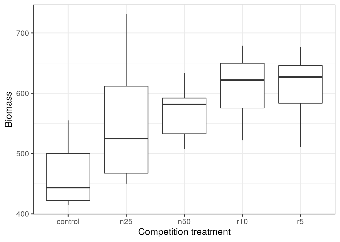
Boxplot representation
- Do you observe any outlier?
- What do the horizontal black lines represent?
- By looking at the medians: Would you expect a statistical difference between the control and the clipping treatments?
- In a boxplot representation, outliers are depicted as dots. In ggplot2, outliers are defined as \(1.5 \times IQR\) of the hinge, where IQR is the inter-quartile range, or distance between the first and third quartiles. (see reference).
- The thick horizontal black line represents the median of each distribution.
- Looking at the medians, we do expect a statistical difference between the control and experiments.
- According to the inter-quantile range, control and n25 are overlapping, hence it should not be statistically different.
Barplots with error bars representation
A popular alternative to a boxplot is the barplot with error bars representation. It is possible to represent different kind of error-bars.
Here, we decide to use the standard error of the mean based on the pooled error variance from the ANOVA. ggplot() is not able to calculate these errors by itself and we will first need to generate the relevant error values. For this, we can use the output of the ANOVA function in R (aov()).
Calling the aov() ANOVA function
Tip
- From the help (
?aov) we can read that theaov()function requires at least a formula argument. - In R, a formula is characterized by the presence of the tilde character (
~) and is constructed as follows:response ~ factorwhich would mean that the variableresponsedepends on the variablefactor.
- Construct the formula describing how the clipping procedure would affect the biomass production.
- Now call the ANOVA using the
aov()function and the formula.
# Formula: biomass ~ clipping
a <- aov(biomass ~ clipping, data = clipping)
Error bars with standard error of the means
Before interpreting the eventual significance of this test, let us calculate the pooled error variance \(s^{2}\) (also called the residual mean square) of the ANOVA.
\[ MSE = s^{2} = \frac{SSE}{DFE} \]
where SSE is the sum of squares of the residuals and DFE is the degree of freedom for the error.
Store the ANOVA result in a variable called a
- Determine the type of the object
a
typeof(a)## [1] "list"- From now on, we would like to stick to a tidyverse approach. Which package would you use to handle these kind of objects?
aov object or the result of summary() is not easily suitable for further processing. The broom package provides functions returning tibbles which fit rectangular data we want to stick to.
- Identify the function providing the value of \(s^{2}\) and extract it. Save the value with the name
mse
mse <- a %>%
  tidy() %>%
  filter(term == "Residuals") %>%
  pull("meansq")
Calculate \(s^{2}\) yourself using a dplyr pipeline
To better appreciate how the \(s^{2}\) value is obtained, you can calculate it yourself starting from the clipping data frame.
- First, generate a tibble containing a single row and 2 columns: the first containing the data and the second the result of the ANOVA.
Tip
nest(). No need to group as we have only one pedictor.
clipping %>%
  nest(data = everything()) %>%
  mutate(aov = map(data, ~ aov(biomass ~ clipping, data = .x)))
## # A tibble: 1 x 2
## data aov
## <list<df[,2]>> <list>
## 1 [30 × 2] <aov>- Add two additional columns that will contain the residuals and the degree of freedom of the residuals.
Tip
broom to obtain the residuals and the degree of freedom for the error. To identify the suitable functions, use the object a you created before to test the different broom functions and select the appropriate ones.
clipping %>%
  nest(data = everything()) %>%
  mutate(aov = map(data, ~ aov(biomass ~ clipping, data = .x))) %>%
  mutate(glance = map(aov, glance),
augment = map(aov, augment)) -> my_s2- extract the residuals and the degree of freedom as two new columns and discard the previous ones.
Tip
broom functions you selected before (using the object a) to identify the names of your columns of interest. Use these names to extract the values of interest.
my_s2 %>%
  mutate(residuals = map(augment, ".resid"),
         df = map_int(glance, "df.residual"))
## # A tibble: 1 x 6
## data aov glance augment residuals df
## <list<df[,2]>> <list> <list> <list> <list> <int>
## 1 [30 × 2] <aov> <tibble [1 × 11]> <tibble [30 × 9]> <dbl [30… 25- calculate the sum of square of the residuals and \(s^2\)
my_s2 %>%
  mutate(residuals = map(augment, ".resid"),
         df = map_int(glance, "df.residual"),
         se = map(residuals, ~ .x^2),
         sse = map_dbl(se, sum),
         meansq = sse / df) %>%
  pull("meansq")
## [1] 4960.813# same value: 4960.813Computing error bars
Now create a tibble containing for each group of clipping method: the mean, number of measures (\(n\)) and the standard error of the mean defined as \(se = \sqrt{s^{2}/n}\). \(s^2\) was computed in the first part, and saved with the name mse
Warning
## # A tibble: 1 x 4
##   clipping mean  n     se
##   <chr>    <chr> <chr> <chr>
## 1 ? ? ? ?clipping %>%
group_by(clipping) %>%
summarise(mean = mean(biomass),
n = n(),
se = sqrt(mse / n))## # A tibble: 5 x 4
## clipping mean n se
## <chr> <dbl> <int> <dbl>
## 1 control 465. 6 28.8
## 2 n25 553. 6 28.8
## 3 n50 569. 6 28.8
## 4 r10 611. 6 28.8
## 5 r5 610. 6 28.8# Here the design is balanced, we have 6 values per group.
# so the means are different but the standard error of the mean is the same for all.- Draw a barchart and add a layer with error bars (
geom_errorbar()) using the calculated standard error of the mean.
Tip
width = 0.5 option.
clipping %>%
  group_by(clipping) %>%
  summarise(mean = mean(biomass),
            n = n(),
se = sqrt(mse / n)) %>%
ggplot(aes(x = clipping, y = mean)) +
geom_col(fill = "goldenrod") +
geom_errorbar(aes(ymax = mean + se, ymin = mean - se), width = 0.5) +
labs(x = "Competition treatment",
y = "Biomass")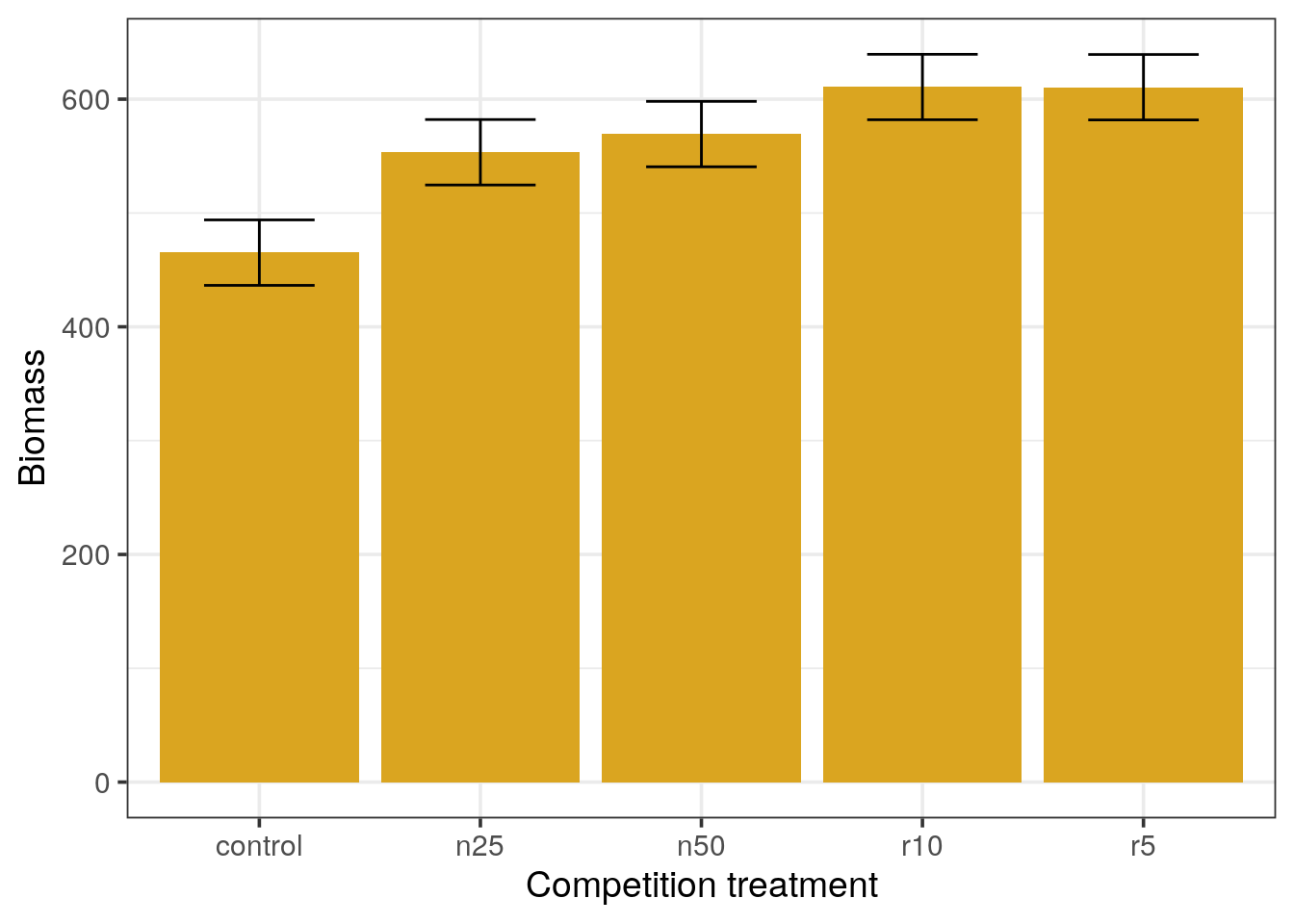
Barplots with standard error of the mean error bars
- Which means appear different from the others?
- In your opinion, what should be the minimal distance between two means in order to consider them significantly different (express the distance in terms of
xfold the standard error).
control and n25.Standard errors of the mean do not represent the variation of measurements but how close we are to the real population mean. Thus, when the sample size increases, the SEM decreases.
Error bars with 95% confidence intervals.
Alternatively we can represent the 95% confidence intervals instead of standard errors of the means to draw the error bars.
- From the t distribution, by which value should we multiply the value of the standard error to obtain the 95% confidence interval? Think about the degree of freedom and the quantile to use.
- Change your previous dataframe accordingly and re-draw the barplots
- What can you conclude?
clipping %>%
  group_by(clipping) %>%
  summarise(mean = mean(biomass),
            n = n(),
            se = sqrt(mse / n),
            ci = se * qt(1 - (0.05 / 2), n - 1)) %>%
  ggplot(aes(x = clipping, y = mean)) +
  geom_col(fill = "goldenrod") +
  geom_errorbar(aes(ymax = mean + ci, ymin = mean - ci), width = 0.5) +
  labs(title = "Barplots with CI error bars",
       x = "Competition treatment",
       y = "Biomass")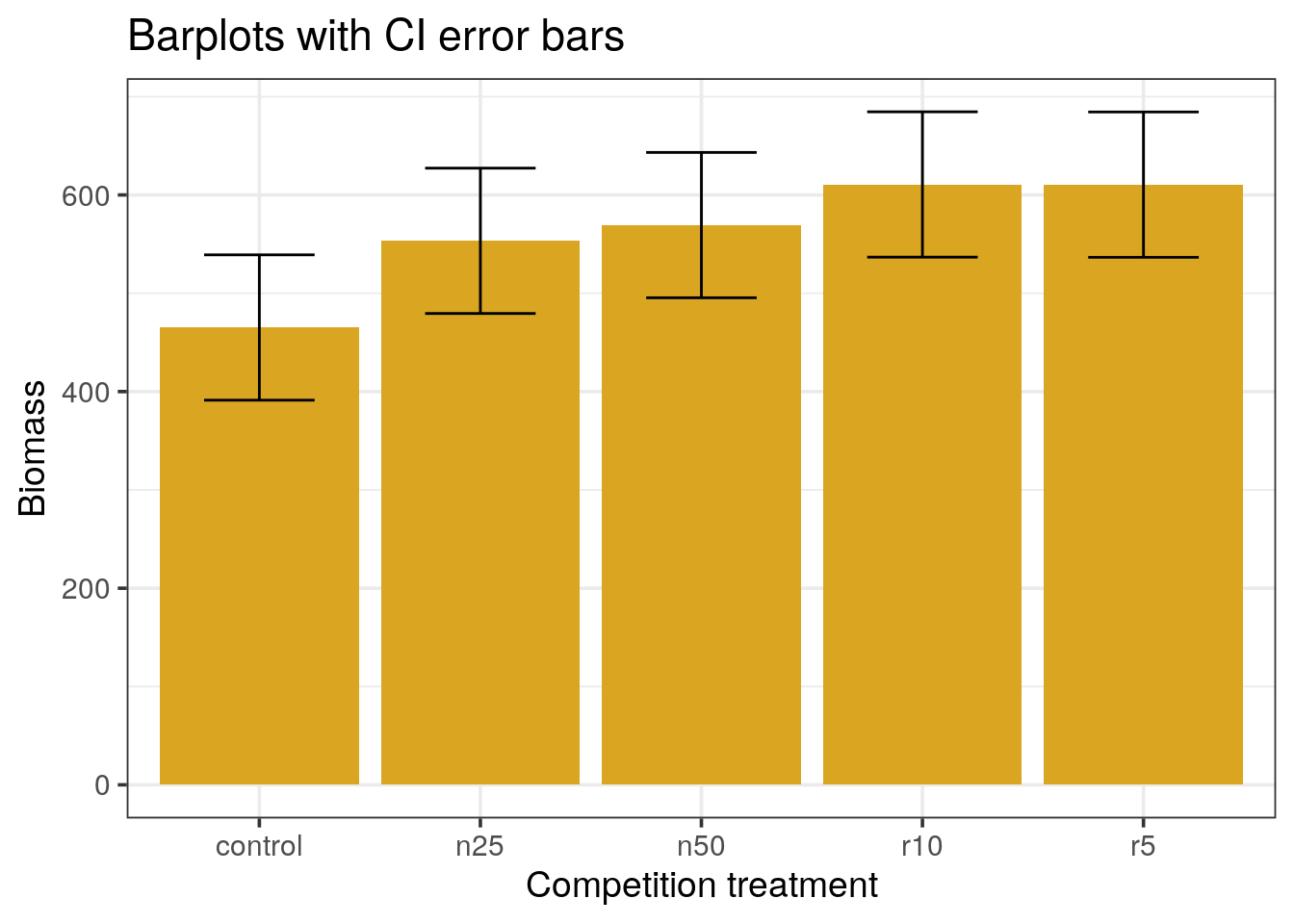
Error bars with the Least Significant Difference
A compromise between the confidence intervals and the standard error is the use of the Least Significant Difference (LSD) measure defined as:
\[LSD = qt(0.975, clipping) \times \text{std error of the difference}\]
Where the degree of freedom for the difference is the sum of both clipping thus the sum of both counts - 2.
- Re-draw the barplots using the LSD measure for the error bars.
clipping %>%
  group_by(clipping) %>%
  summarise(mean = mean(biomass),
            n = n(),
            se = sqrt(mse / n),
            ci = se * qt(0.975, n - 1),
            lsd = qt(0.975, 2 * n - 2) * sqrt(2 * mse / n)) %>%
  ggplot(aes(x = clipping, y = mean)) +
  geom_col(fill = "goldenrod") +
  geom_errorbar(aes(ymax = mean + lsd / 2,
                    ymin = mean - lsd / 2),
                width = 0.5) +
  labs(title = "Barplots with LSD error bars",
       x = "Competition treatment",
       y = "Biomass")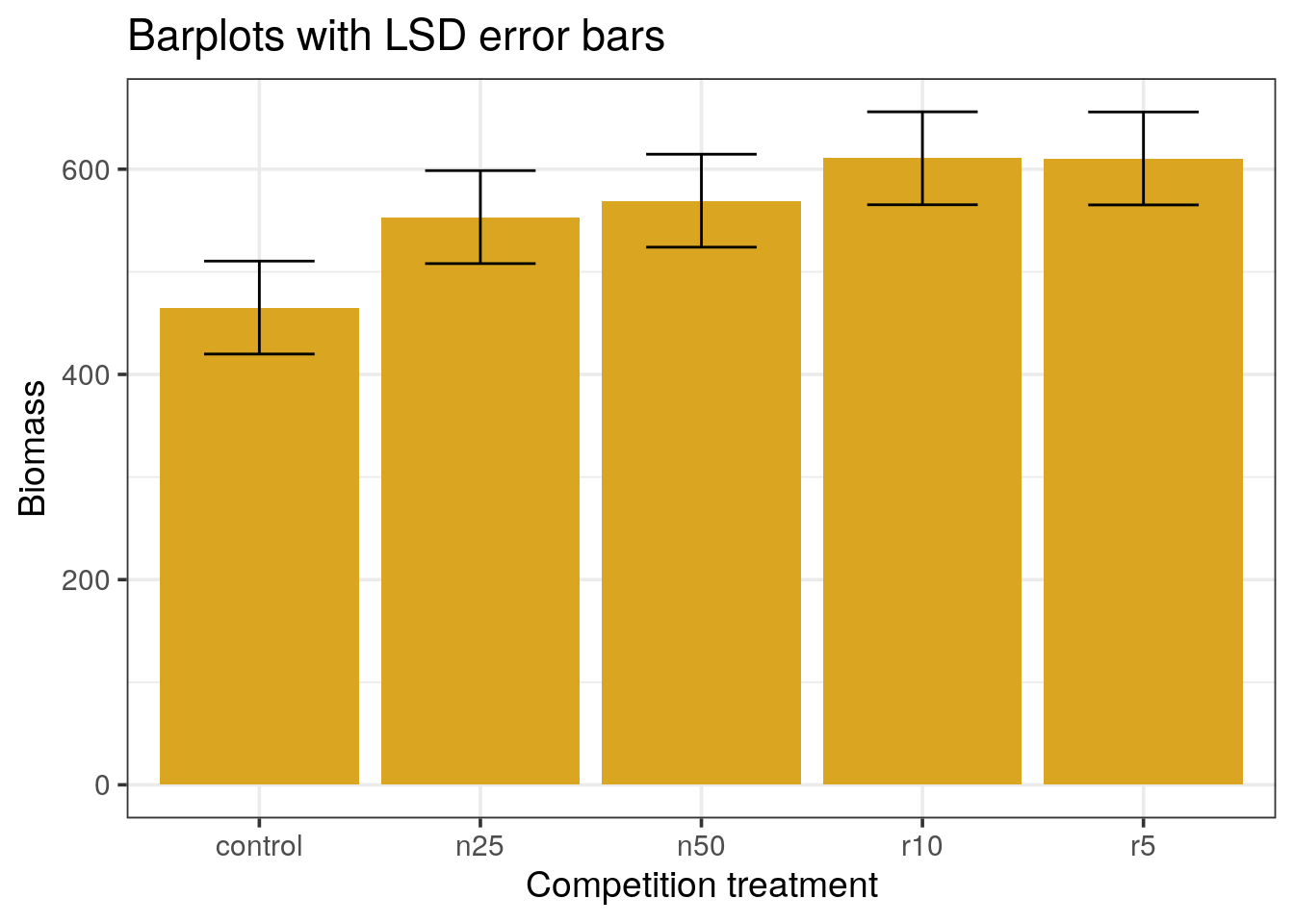
The LSD approach uses the common definition of \(t = \frac{a difference}{standard error}\).
In the confidence interval approach, we used the confidence for one mean, while we want to compare means, not assess the dispersion for one. The LSD takes the difference between two means, with their global variance. In this example, it works out because all variances are equal, so we can compute the standard error of the difference by multiplying by the se. The degrees of freedom are then the pooled sample size minus the two parameters estimated from the data: the two means.
This approach gives a much better visual aspect of the differences, only r10 and r5 are different from the control. However, it suffers from 2 drawbacks:
- This is a particular case where the variances and sample sizes are identical across levels
- More importantly, it does not take the problem of multiple testing into account.
Summary of the ANOVA
Checking ANOVA assumptions
Before interpreting the significance of the ANOVA, let us check if the prerequisites are met.
- What should we check?
Tip
bartlett.test()) is useful for one of the ANOVA’s assumption
The assumptions of ANOVA are:
- The groups should be independent. According to the design of the study, this is OK.
- The data should be normally distributed. If the data is normally distributed and the model appropriate, the residuals should be normally distributed which we can test.
- The variances should be homogene. We can use the bartlett test to check for the homogeneity.
- Nest the clipping dataset to a single cell and perform the Bartlett test.
Get the result of the Bartlett test as a tibble.
clipping %>%
  nest() %>%
  mutate(bartlett = map(data, ~bartlett.test(biomass ~ clipping, data = .x)),
         bartlett = map(bartlett, broom::tidy)) %>%
  unnest(bartlett)
## Warning: `...` must not be empty for ungrouped data frames.
## Did you want `data = everything()`?## # A tibble: 1 x 5
## data statistic p.value parameter method
## <list<df[,2]> <dbl> <dbl> <dbl> <chr>
## 1 [30 × 2] 4.44 0.350 4 Bartlett test of homogeneity o…- To test the normality, use
purrrto:- perform the ANOVA
- extract the residuals
- perform the Shapiro-Wilk test on the residuals
- format the result as a (nested) data frame
Tip
gather() to get a nice output.
clipping %>%
  nest() %>%
  mutate(bartlett = map(data, ~bartlett.test(biomass ~ clipping, data = .x)),
         bartlett = map(bartlett, tidy),
         aov = map(data, ~aov(biomass ~ clipping, data = .x)),
         augment = map(aov, augment),
         residuals = map(augment, ".resid"),
         shapiro = map(residuals, shapiro.test),
         shapiro = map(shapiro, tidy)) %>%
  select(shapiro, bartlett) %>%
  pivot_longer(names_to = "test",
               values_to = "tidy",
               cols = c(shapiro, bartlett)) %>%
  unnest()
## Warning: `...` must not be empty for ungrouped data frames.
## Did you want `data = everything()`?## Warning: `cols` is now required.
## Please use `cols = c(tidy)`## # A tibble: 2 x 5
## test statistic p.value method parameter
## <chr> <dbl> <dbl> <chr> <dbl>
## 1 shapiro 0.965 0.415 Shapiro-Wilk normality test NA
## 2 bartlett 4.44 0.350 Bartlett test of homogeneity of var… 4Is it possible to perform the ANOVA?
Two assumptions are made with the ANOVA and they are linked:
- The variance needs to be homogeneous across the dataset. The bartlett test looks for the homoscedasticity and we can reject the hypothesis that the variance is not homogeneous.
- The residuals should have a normal distribution. We can test this using the Shapiro-Wilk test. Again, the residuals appear to follow a normal distribution.
Interpreting the ANOVA
Using the summary() function, check the p-value of the ANOVA.
What is your conclusion?
aov(biomass ~ clipping, data = clipping) %>%
  glance()
## # A tibble: 1 x 11
## r.squared adj.r.squared sigma statistic p.value df logLik AIC BIC
## <dbl> <dbl> <dbl> <dbl> <dbl> <int> <dbl> <dbl> <dbl>
## 1 0.408 0.313 70.4 4.30 0.00875 5 -167. 347. 355.
## # … with 2 more variables: deviance <dbl>, df.residual <int>
# OR
aov(biomass ~ clipping, data = clipping) %>%
  summary()
## Df Sum Sq Mean Sq F value Pr(>F)
## clipping 4 85356 21339 4.302 0.00875 **
## Residuals 25 124020 4961
## ---
## Signif. codes: 0 '***' 0.001 '**' 0.01 '*' 0.05 '.' 0.1 ' ' 1Post-hoc analysis
The ANOVA is able to tell us if there is a difference between the biomass means obtained after different clipping methods but it does not tell us which method might be responsible for the difference.
Tip
TukeyHSD() function which perform such a post-hoc test for ANOVA analyses.
- Why are these post-hoc tests important?
- perform the post-hoc test
aov(biomass ~ clipping, data = clipping) %>% # Performing the ANOVA analysis on clipping
  TukeyHSD()                                 # Performing the Tukey post-hoc test
## Tukey multiple comparisons of means
## 95% family-wise confidence level
##
## Fit: aov(formula = biomass ~ clipping, data = clipping)
##
## $clipping
## diff lwr upr p adj
## n25-control 88.1666667 -31.25984 207.5932 0.2243248
## n50-control 104.1666667 -15.25984 223.5932 0.1088202
## r10-control 145.5000000 26.07350 264.9265 0.0115253
## r5-control 145.3333333 25.90683 264.7598 0.0116387
## n50-n25 16.0000000 -103.42650 135.4265 0.9946026
## r10-n25 57.3333333 -62.09317 176.7598 0.6272414
## r5-n25 57.1666667 -62.25984 176.5932 0.6297485
## r10-n50 41.3333333 -78.09317 160.7598 0.8453941
## r5-n50 41.1666667 -78.25984 160.5932 0.8472695
## r5-r10 -0.1666667 -119.59317 119.2598 1.0000000- Represent the conclusion of this test graphically: Use the
tidy()function (from thebroomlibrary) to generate a suitable data.frame and plot the ranges withgeom_pointrange().
aov(biomass ~ clipping, data = clipping) %>%
  TukeyHSD() %>%
  tidy() %>%
  mutate(comparison = fct_reorder(comparison, estimate)) %>%
  ggplot() +
  geom_pointrange(aes(x = comparison, y = estimate,
                      ymin = conf.low, ymax = conf.high,
                      colour = adj.p.value < 0.05), size = 1.2) +
  geom_hline(yintercept = 0, linetype = "dashed") +
  coord_flip() +
  labs(title = "clipping",
       subtitle = "post-hoc Tukey",
       x = "difference",
       y = "comparison")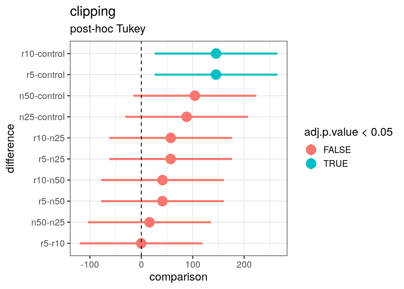
- What is your final conclusion in particular with regard to the previously produced plots?
The correction for multiple testing has been done and the adjusted p-values tell us that only the r10 versus control and r5 versus control are actually significantly different. This confirms the conclusion we made after the LSD plot. For the other comparisons, the range is overlapping the zero (vertical dashed line) which tells us that we cannot conclude the difference is real.
In conclusion, to obtain a significant biomass increase:
- only the clipping of roots is relevant
- clipping the roots at 5 or 10 centimeters does not make any difference