
TD - simple linear models
Eric Koncina, Aurélien Ginolhac
2019-11-14
Simple linear model
In order to tryout linear models in R we are going to use the
blood_fatdataset which contains the age (in years), weight (in kg) and measured fat concentrations (units were not mentioned) in blood samples of different subjects.
Relation of blood fat content and age
We would like to determine whether the blood concentration in fat is related to the age of the subjects.
- load the data (
csv) available here in R
blood_fat <- read_csv("data/blood_fat.csv")## Parsed with column specification:
## cols(
## id = col_double(),
## one = col_double(),
## weight = col_double(),
## age = col_double(),
## fat = col_double()
## )Visualization
- If the goal would be to guess the fat concentration knowing someones age, find out which are the response and predictor variables and draw the according scatter plot.
- Add a regression line (without the confidence interval ribbon).
blood_fat %>%
  ggplot(aes(x = age, y = fat)) +
  geom_point() +
  geom_smooth(method = "lm", se = FALSE)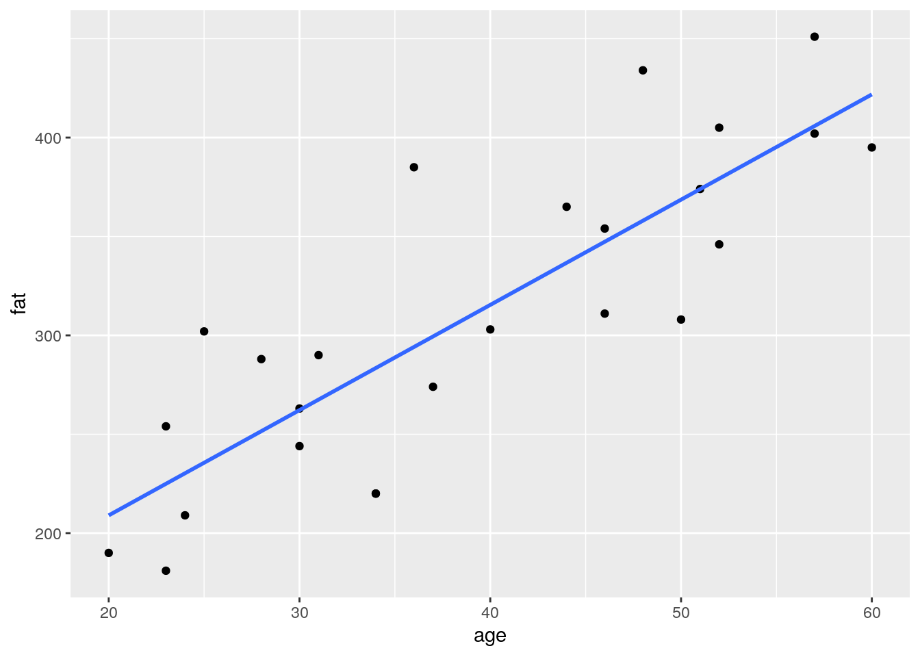
- Add a new column to the
blood_fatdata frame containing the expected fat levels from the linear model.- For each subject in the data frame, add these predicted values as red points on your previous plot.
- Using
geom_segment(), connect the expected values to the measured values as dotted lines.
Tip
broom function after the linear model, to fetch all those information in one tibble
blood_fat %>%
  lm(fat ~ age, data = .) %>%
  augment() %>%
  ggplot(aes(x = age, y = fat)) +
  geom_point() +
  geom_smooth(method = "lm", se = FALSE) +
  geom_segment(aes(xend = age, yend =  .fitted), linetype = "dotted") +
  geom_point(aes(y = .fitted), color = "red")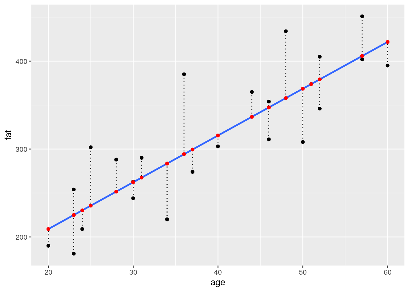
- Calculate the slope and intercept of the regression line
blood_fit <- lm(fat ~ age, data = blood_fat)

# slope:
coef(blood_fit)["age"]
## age
## 5.320676# intercept:
coef(blood_fit)["(Intercept)"]## (Intercept)
## 102.5751# alternative:
tidy(blood_fit)## # A tibble: 2 x 5
## term estimate std.error statistic p.value
## <chr> <dbl> <dbl> <dbl> <dbl>
## 1 (Intercept) 103. 29.6 3.46 0.00212
## 2 age 5.32 0.724 7.35 0.000000179- draw a dashed lightblue line using explicitly the values you calculated in the previous question
augment(blood_fit) %>%
  ggplot(aes(x = age, y = fat)) +
  geom_point() +
  geom_abline(slope = coef(blood_fit)[2],
              intercept = coef(blood_fit)[1], colour = "lightblue") +
  geom_point(aes(y = .fitted), color = "red") +
  geom_segment(aes(xend = age, yend =  .fitted), linetype = "dotted")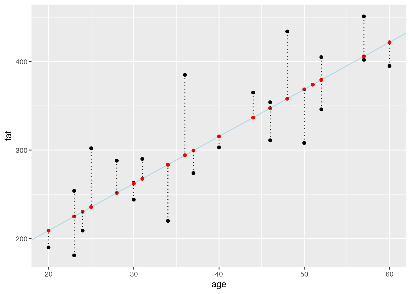
Calculate \(R^2\)
You learned that \(R^2\) can be calculated as follows:
\[R^2 = 1- \frac{\sum(y_i - \hat{y_i})^2}{\sum(y_i - \bar{y})^2} = 1- \frac{RSS}{TSS}\]
- The length of the dotted lines you just represented are related to a term of this equation. Which one?
- Using
mutate(), add the length of each dotted line to theblood_fatdata frame.
# Using augment
augment(blood_fit) %>%
  mutate(length = fat - .fitted) %>%
  select(fat, age, .fitted, length, .resid) %>%
  head()
## # A tibble: 6 x 5
## fat age .fitted length .resid
## <dbl> <dbl> <dbl> <dbl> <dbl>
## 1 354 46 347. 6.67 6.67
## 2 190 20 209. -19.0 -19.0
## 3 405 52 379. 25.7 25.7
## 4 263 30 262. 0.805 0.805
## 5 451 57 406. 45.1 45.1
## 6 302 25 236. 66.4 66.4# Using predict
blood_fat %>%
mutate(predicted = predict(blood_fit),
length = fat - predicted,
residuals = residuals(blood_fit)) %>%
head()## # A tibble: 6 x 8
## id one weight age fat predicted length residuals
## <dbl> <dbl> <dbl> <dbl> <dbl> <dbl> <dbl> <dbl>
## 1 1 1 84 46 354 347. 6.67 6.67
## 2 2 1 73 20 190 209. -19.0 -19.0
## 3 3 1 65 52 405 379. 25.7 25.7
## 4 4 1 70 30 263 262. 0.805 0.805
## 5 5 1 76 57 451 406. 45.1 45.1
## 6 6 1 69 25 302 236. 66.4 66.4- What do these length represent? Which functions in R generates these values?
Each length is called a residual. 3 base functions return them
residuals(fit)resid(fit)predict(fit)
broom::augment(fit) also return residuals in the .resid column
- Draw a darkgreen horizontal line showing the mean fat concentration of all measures.
- Use
geom_segment()to connect all points representing the real measures to their projection on this horizontal line (using a darkgreen color with alpha = 0.2 and a size of 2).
augment(blood_fit) %>%
  ggplot(aes(x = age, y = fat)) +
  geom_point() +
  geom_smooth(method = "lm", se = FALSE) +
  geom_abline(slope = coef(blood_fit)[2], intercept = coef(blood_fit)[1],
              linetype = "dashed", color = "lightblue") +
  geom_segment(aes(xend = age, yend =  .fitted), linetype = "dotted") +
  geom_hline(aes(yintercept = mean(fat)), colour = "darkgreen") +
  geom_segment(aes(xend = age, yend =  mean(fat)), colour = "darkgreen", alpha = 0.2, size = 2) +
  geom_point(aes(y = .fitted), color = "red")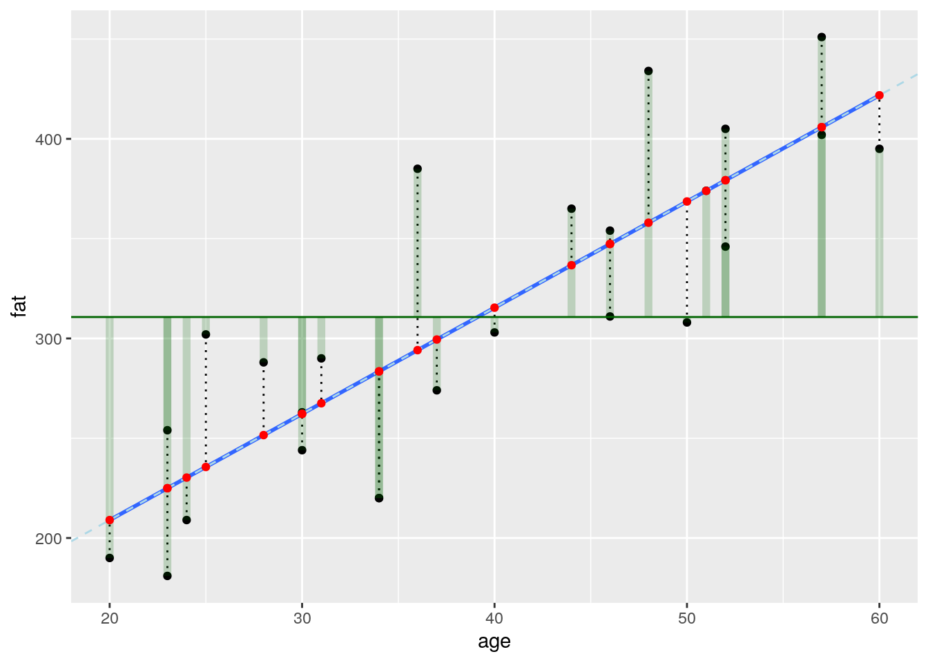
- Using
mutate(), add the length of each green translucid line to theblood_fatdata frame. What do they represent? And the sum of their squared length?
Tip
- Calculate \(RSS\), \(TSS\) and \(R^2\)
augment(blood_fit) %>%
  select(fat, .fitted, .resid) %>%
  mutate(diff2mean = fat - mean(fat)) %>%
  summarise(TSS = sum(diff2mean^2), #total variance of fat
            RSS = sum(.resid^2), # variance of residuals
            R2 = 1 - RSS / TSS) %>%
knitr::kable()| TSS | RSS | R2 |
|---|---|---|
| 145377 | 43444.37 | 0.7011607 |
glance(blood_fit) %>%
knitr::kable()| r.squared | adj.r.squared | sigma | statistic | p.value | df | logLik | AIC | BIC | deviance | df.residual |
|---|---|---|---|---|---|---|---|---|---|---|
| 0.7011607 | 0.6881677 | 43.46131 | 53.96444 | 2e-07 | 2 | -128.728 | 263.4559 | 267.1126 | 43444.37 | 23 |
- Is there really a relationship between blood fat content and age?
- What does the value of \(R^2\) tell you?
Checking the residuals of the model
- residuals’s mean
- what is the expectation for the residuals’s mean?
- compute the residuals’s mean for the fat explained by age model.
# lm is minimazing the RSS and their mean is aim at ~ zero
residuals(blood_fit) %>%
  mean()
## [1] -1.118203e-15# indeed very close to zero- Can the measures appropriately be modelled in this way? Draw two diagnosis plots using
ggplot2- In the first draw the residuals on the y axis and the estimated values on the x axis
- Your second one should be a quantile-quantile plot.
Tip
ggfortify and the function autoplot(fit) can produce the classic 4 diagnostic plots with no efforts
blood_fit %>%
  augment() %>%
  ggplot(aes(x = .fitted, y = .resid)) +
    geom_point()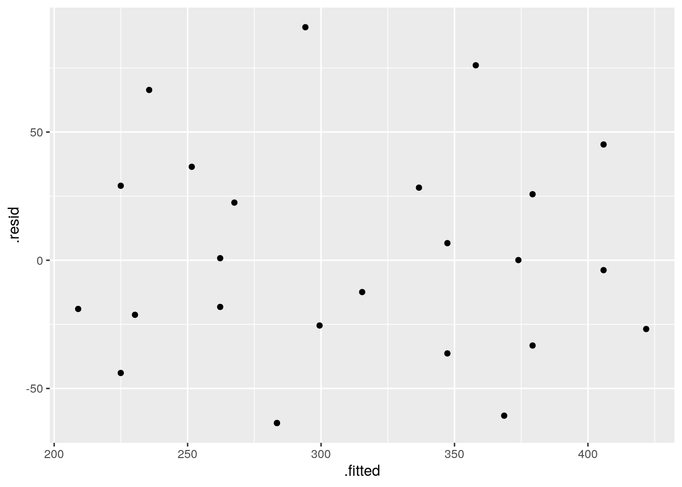
blood_fit %>%
  augment() %>%
  ggplot() +
    stat_qq(aes(sample = .resid))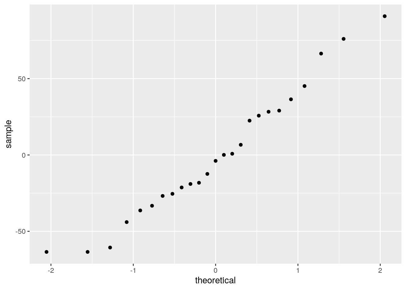
Relation of blood fat content and weight
- change predictor and use
weightinstead ofageto predict the fat concentration
blood_fat %>%
  ggplot(aes(x = weight, y = fat)) +
  geom_point() +
  geom_smooth(method = "lm")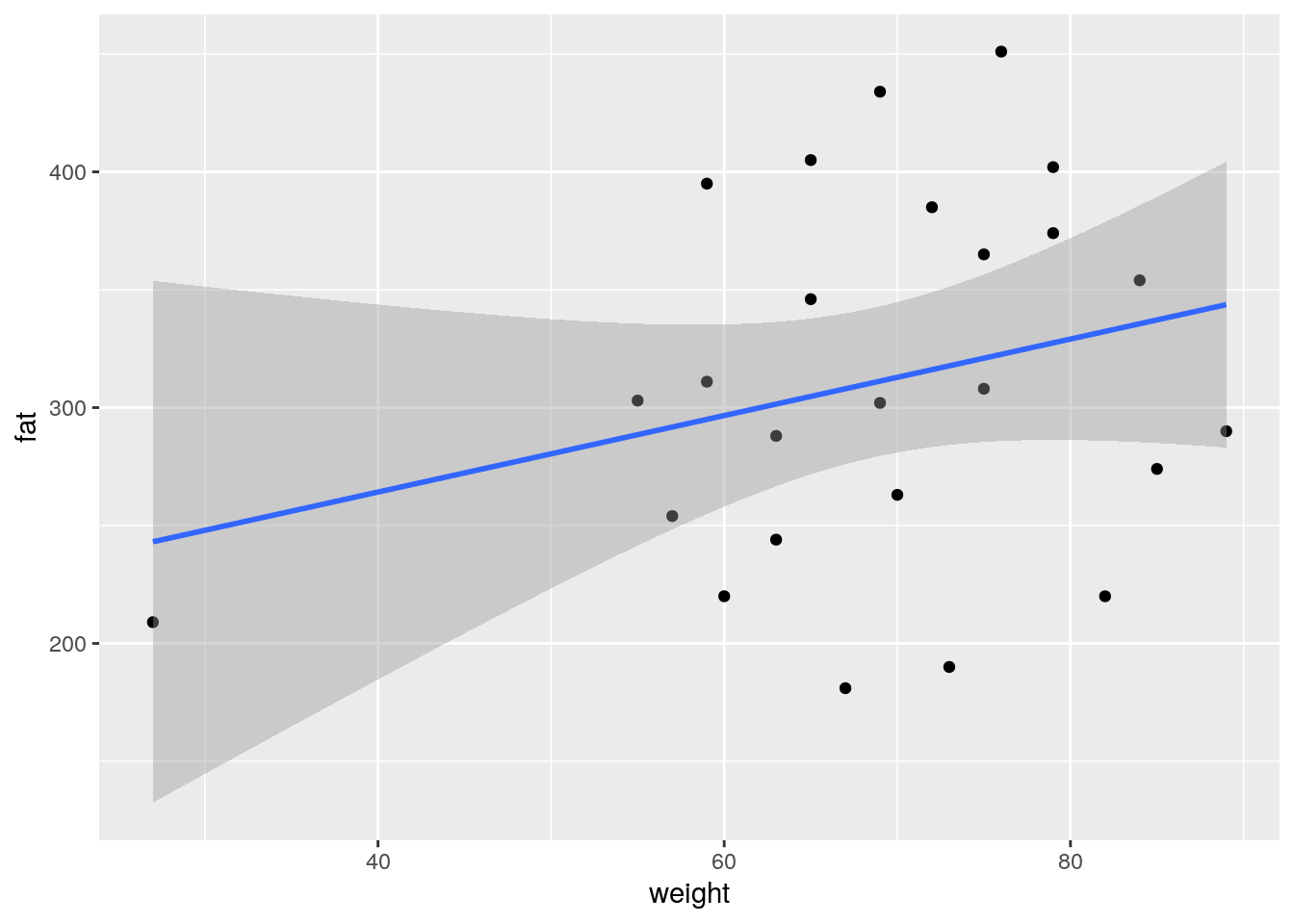
- What does the ADF method tells you?
- check the summary and diagnostic plots for this regression
fit_weight <- lm(fat ~ weight, data = blood_fat)
summary(fit_weight)
##
## Call:
## lm(formula = fat ~ weight, data = blood_fat)
##
## Residuals:
## Min 1Q Median 3Q Max
## -127.729 -53.686 -9.239 46.537 128.404
##
## Coefficients:
## Estimate Std. Error t value Pr(>|t|)
## (Intercept) 199.298 85.818 2.322 0.0294 *
## weight 1.622 1.229 1.320 0.2000
## ---
## Signif. codes: 0 '***' 0.001 '**' 0.01 '*' 0.05 '.' 0.1 ' ' 1
##
## Residual standard error: 76.65 on 23 degrees of freedom
## Multiple R-squared: 0.07038, Adjusted R-squared: 0.02996
## F-statistic: 1.741 on 1 and 23 DF, p-value: 0.2library(ggfortify)
autoplot(fit_weight)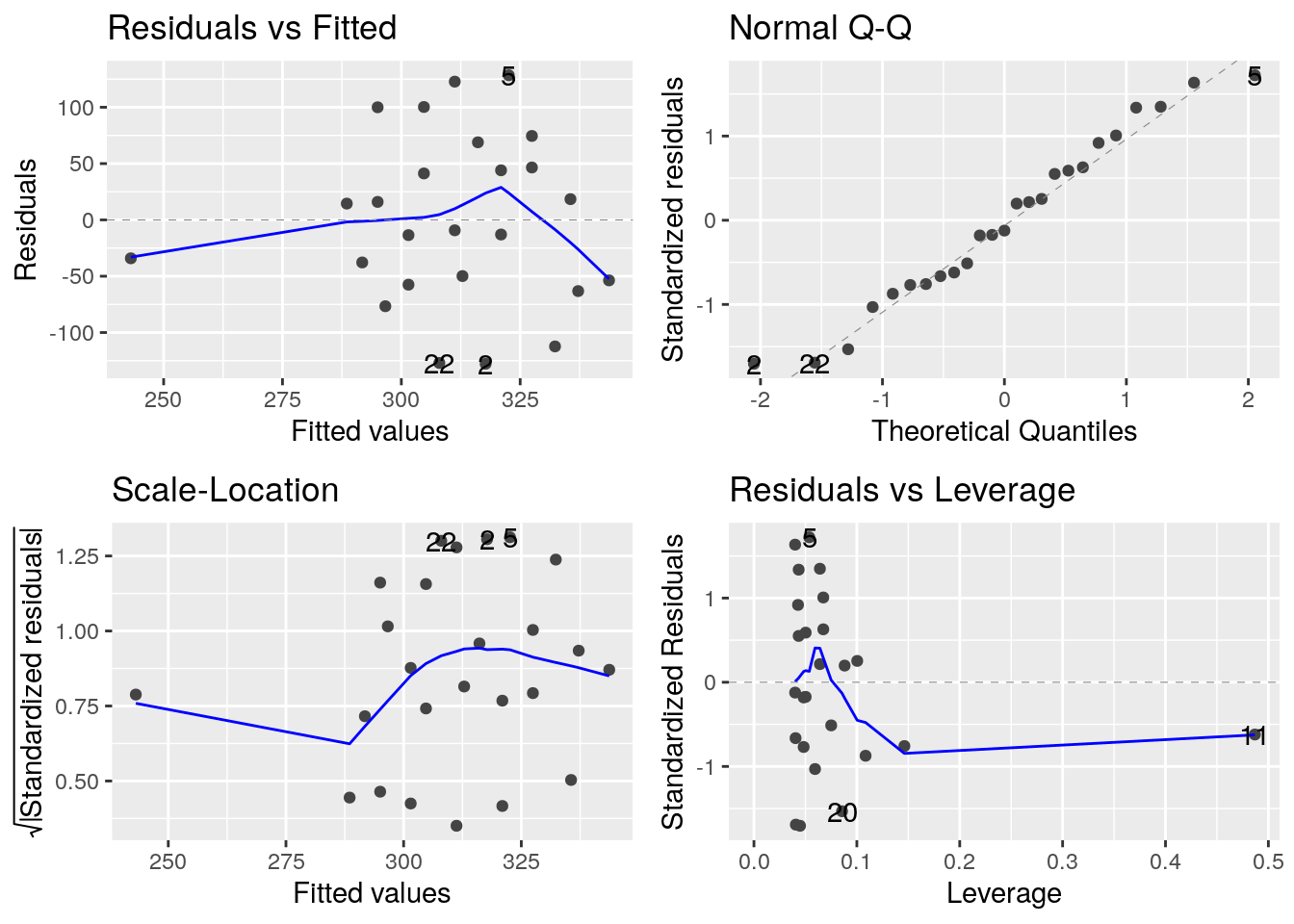
- Can the blood content in fat be explained by the weight of the subject?
Linear models and data transformation

In this exercise, we will use the
diamondsdataset provided in theggplot2library. We would like to analyse the relationship between the price of diamonds and their weight (in carats) and limit our study to diamonds with a weight lower or equal to 2.5 carats. this exercise is adapted from Hadley Wickhams example
- Create a data frame
diamonds2containing only diamonds with a \(weight \leq 2.5\).- How many entries are in this data frame?
- What is the proportion of entries contained in
diamonds2when compared to the originaldiamondsdata frame?
diamonds2 <- filter(diamonds, carat <= 2.5)

# Number of entries
count(diamonds2)
## # A tibble: 1 x 1
## n
## <int>
## 1 53814# Proportion of entries
nrow(diamonds2) / nrow(diamonds)## [1] 0.9976641# We do still have more than 99.7% of the original data- Create a plot showing the price of diamonds being explained by their weight.
Tip
geom_hex() instead of geom_point(). It might also be appropriate to override the default number of bins in geom_hex() (set it for example to 50). You might need to install the package hexbin if your console tells you so. For the filling, the viridis palette offers a much better alternative to the default
# be sure to have hexbin
library(hexbin)
diamonds2 %>%
ggplot(aes(x = carat, y = price)) +
  geom_hex(bins = 50, colour = "grey50") +
  scale_fill_viridis_c()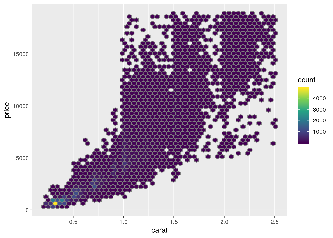
- Add a red linear regression line to the plot
diamonds2 %>%
ggplot(aes(x = carat, y = price)) +
  geom_hex(bins = 50) +
  scale_fill_viridis_c() +
  geom_smooth(method = "lm", colour = "red", size = 2)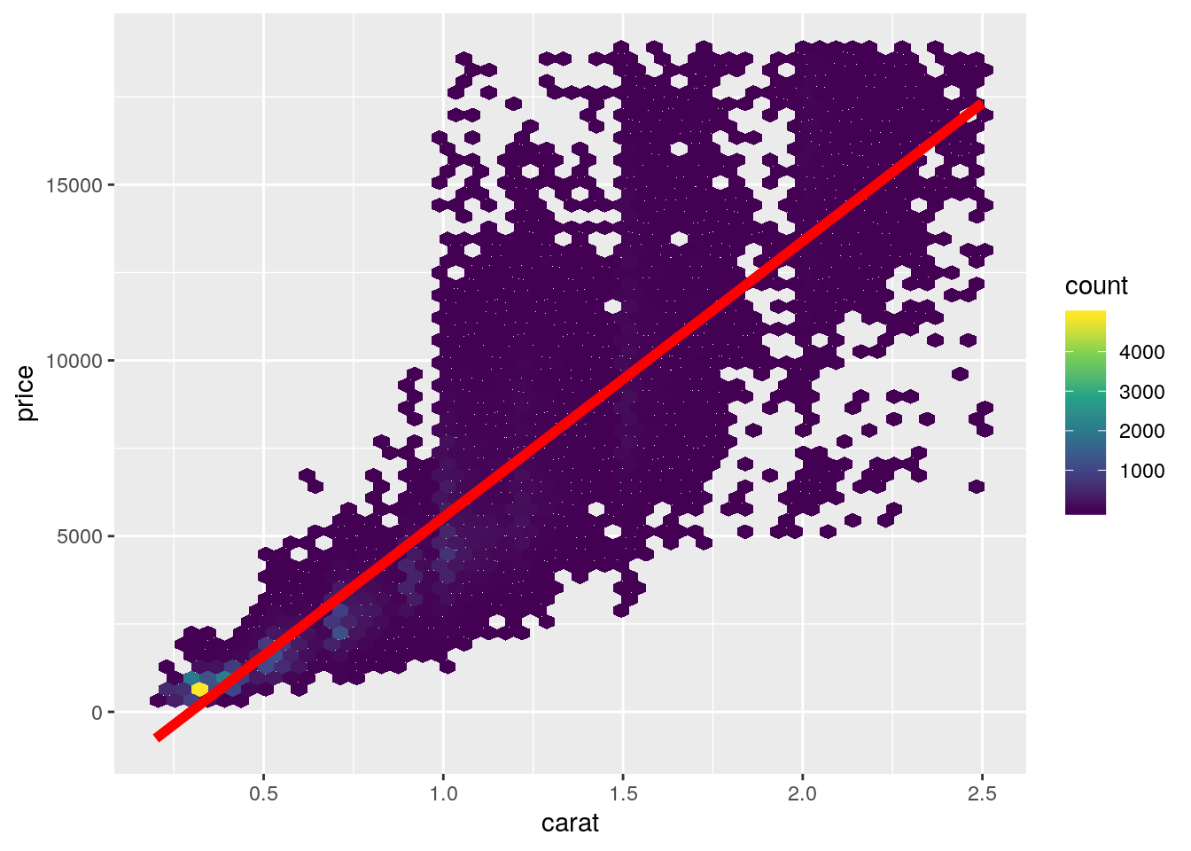
- Draw the residuals diagnosis plots
set.seed(161102)
diam_model <- lm(price ~ carat, data = diamonds2)

diam_model %>%
  augment() %>%
  sample_n(1000) %>%
  ggplot(aes(x = carat, y = .resid)) +
    geom_point()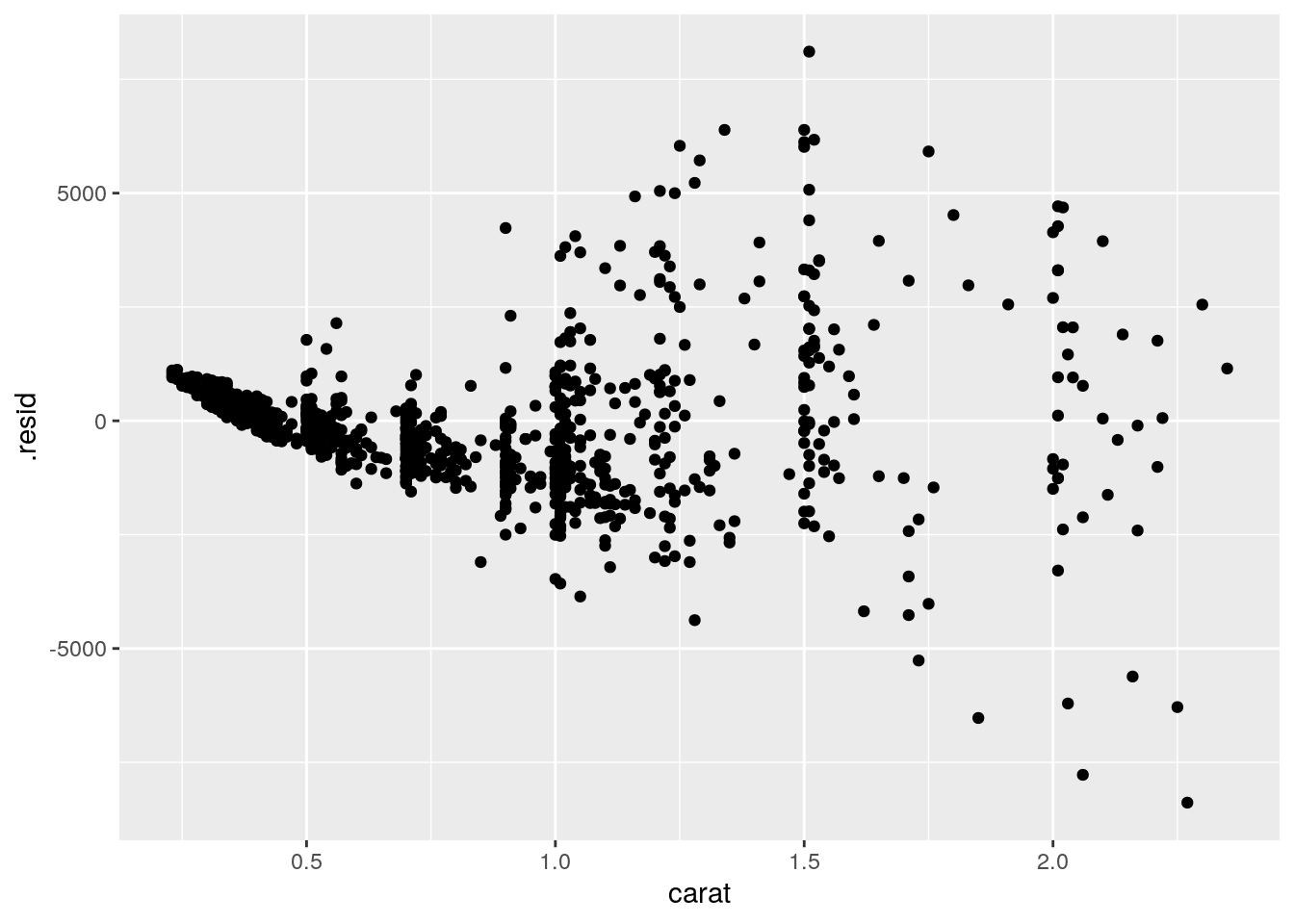
diam_model %>%
  augment() %>%
  sample_n(1000) %>%
  ggplot() +
  stat_qq(aes(sample = .resid))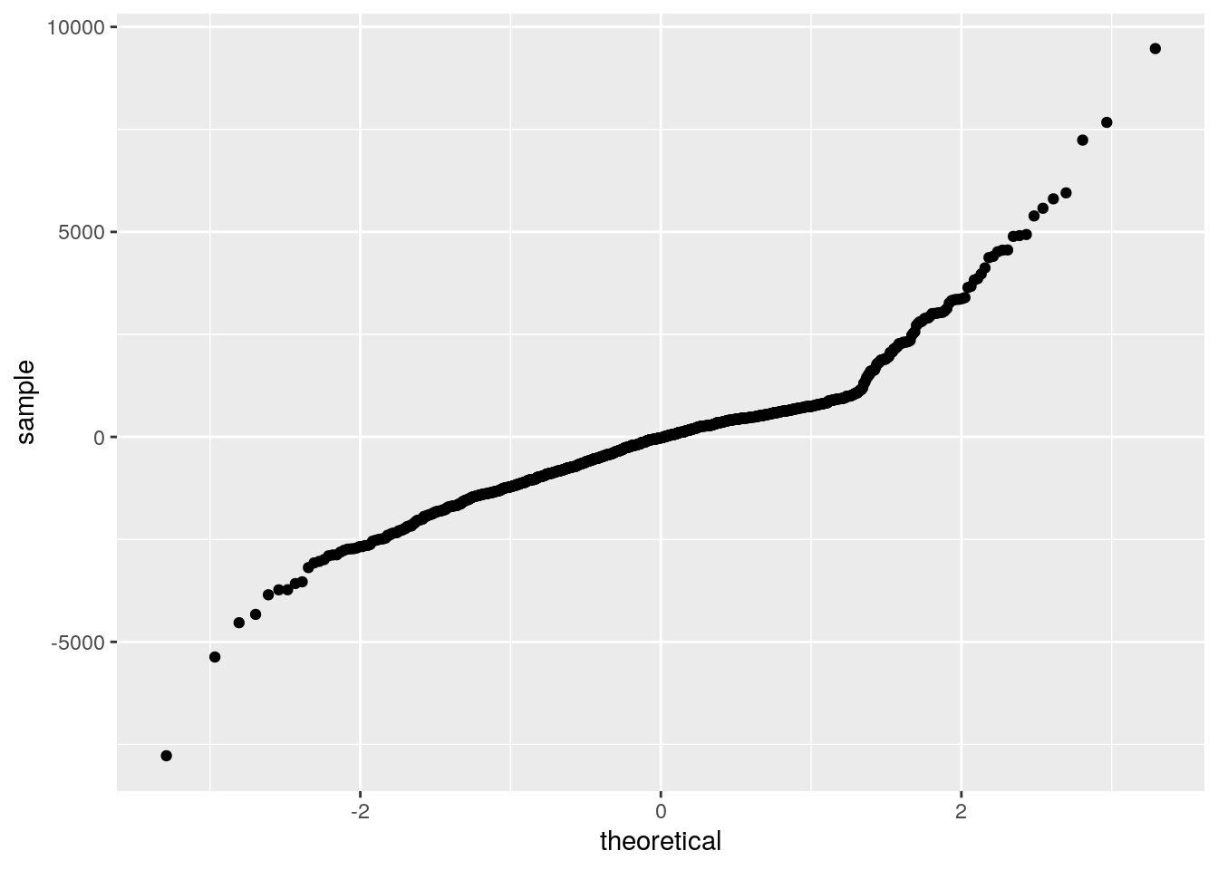
- What is your conclusion out of these plots?
- The hexagon binning plot already showed that the linear regression might not be appropriate and that there is an enrichment in diamonds having a low weight and a low price
- draw a density plot showing how the weights are distributed
- draw a density plot showing how the prices are distributed
diamonds2 %>%
  ggplot(aes(x = carat)) +
  geom_density()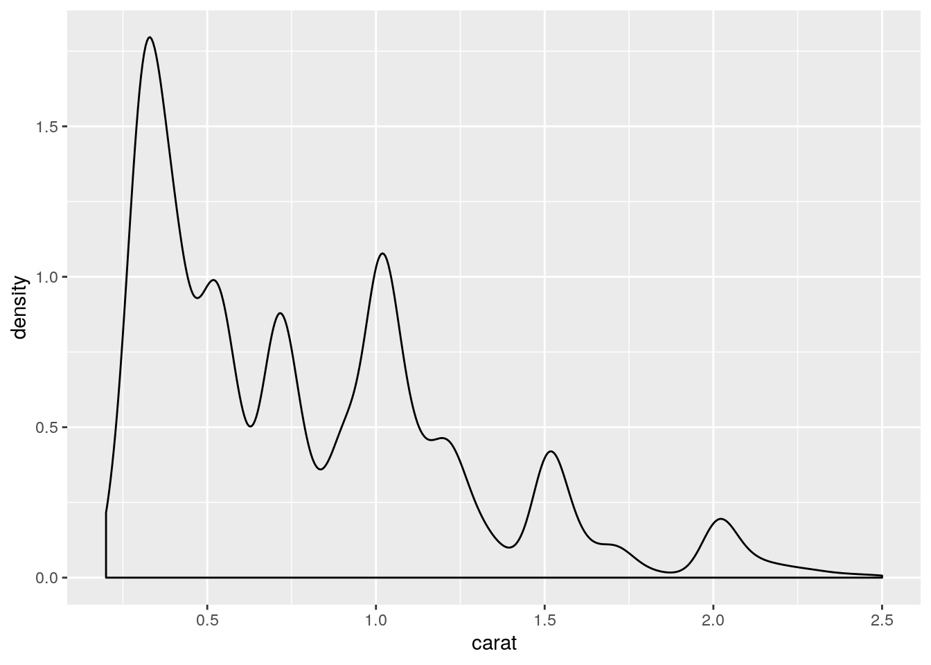
diamonds2 %>%
  ggplot(aes(x = price)) +
  geom_density()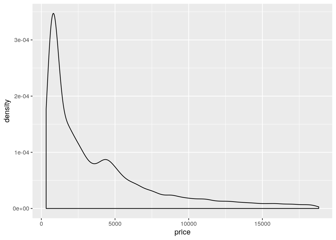
- To better discriminate lower weight/price values without excluding higher weights/prices, we can try to apply a log transformation (i.e.
log2).- Create two new columns
lcaratandlpricecontaining the log2 transformed weights and prices respectively.
- Create two new columns
diamonds2 <- diamonds2 %>%
  mutate(lcarat = log2(carat), lprice = log2(price))
+ Redraw the density plots using the log2 transformed valuesdiamonds2 %>%
ggplot(aes(x = lcarat)) +
geom_density()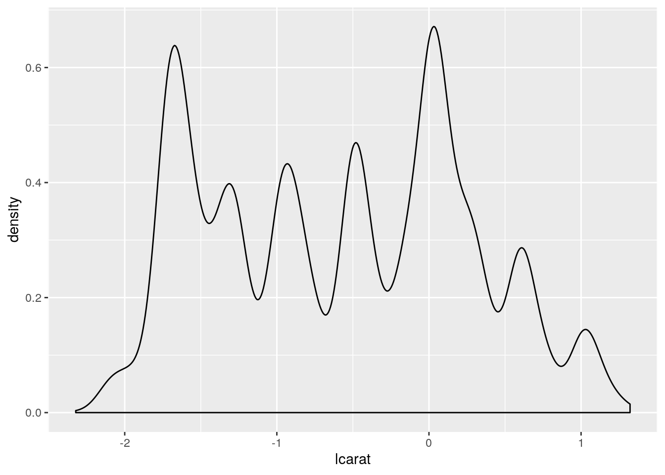
diamonds2 %>%
  ggplot(aes(x = lprice)) +
  geom_density()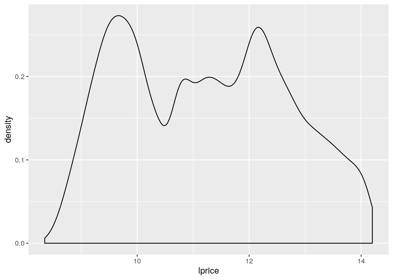
- redraw the first plot (price of diamonds being explained by their weight) using the log2 transformed values
- add again a red linear regression line using the log2 transformed values
diamonds2 %>%
ggplot(aes(x = lcarat, y = lprice)) +
  geom_hex(bins = 50) +
  scale_fill_viridis_c() +
  geom_smooth(method = "lm", colour = "red", size = 2)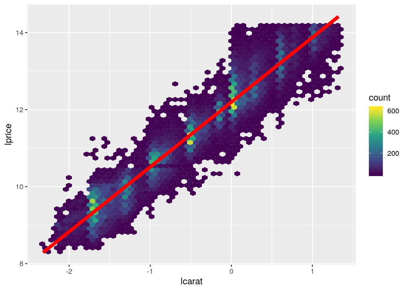
- redraw the diagnosis plots to analyse how the residuals are distributed
diam_lmodel <- lm(lprice ~ lcarat, data = diamonds2)

set.seed(161102)

diam_lmodel %>%
  augment() %>%
  sample_n(1000) %>%
  ggplot(aes(x = lcarat, y = .resid)) +
    geom_point()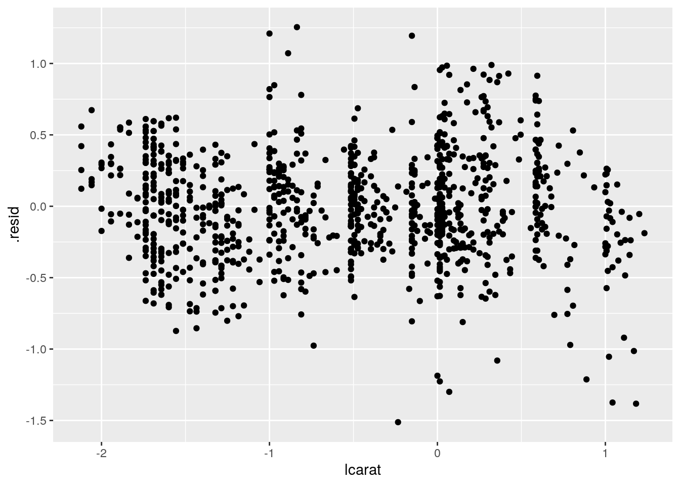
diam_lmodel %>%
  augment() %>%
  sample_n(1000) %>%
  ggplot() +
  stat_qq(aes(sample = .resid))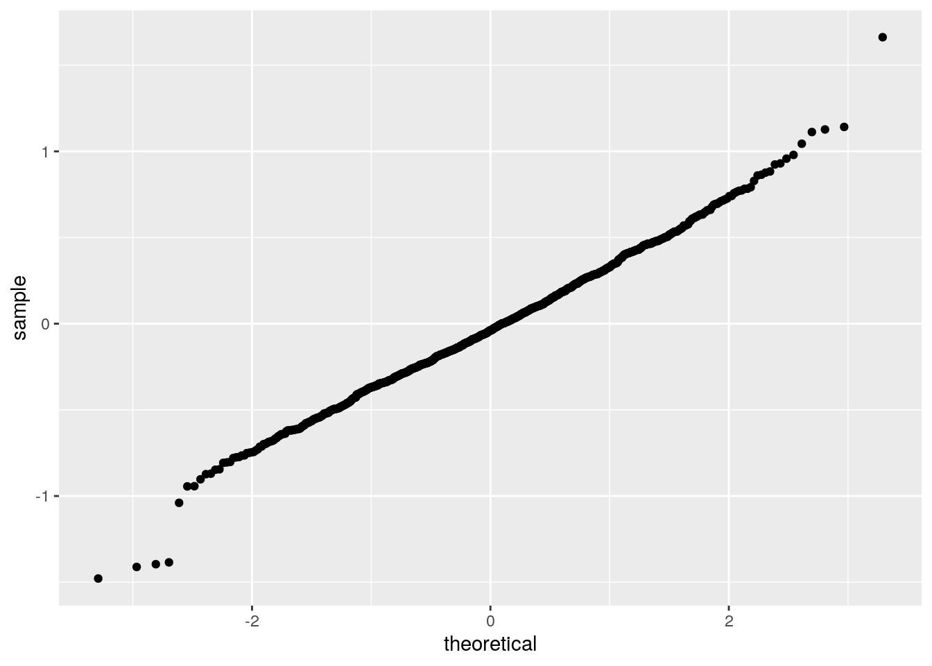
- what are your conclusions out of these plots?
- analyse the output of the linear model in R base
- What are your conclusions?
summary(diam_lmodel)##
## Call:
## lm(formula = lprice ~ lcarat, data = diamonds2)
##
## Residuals:
## Min 1Q Median 3Q Max
## -1.96407 -0.24549 -0.00844 0.23930 1.93486
##
## Coefficients:
## Estimate Std. Error t value Pr(>|t|)
## (Intercept) 12.193863 0.001969 6194.5 <2e-16 ***
## lcarat 1.681371 0.001936 868.5 <2e-16 ***
## ---
## Signif. codes: 0 '***' 0.001 '**' 0.01 '*' 0.05 '.' 0.1 ' ' 1
##
## Residual standard error: 0.3767 on 53812 degrees of freedom
## Multiple R-squared: 0.9334, Adjusted R-squared: 0.9334
## F-statistic: 7.542e+05 on 1 and 53812 DF, p-value: < 2.2e-16Getting back to the original linear scale
- Now we would like to draw the plot using the raw values (without transformation) but showing the appropriate (back transformed) linear regression
- You were already able, several times, to draw points that are on the regression line.
- Similarly use all these points to draw a connecting red line
- Do not forget to appropriately back transform the predictions
Tip
geom_line() to draw such a line
augment(diam_lmodel) %>%
  ggplot(aes(2^lcarat, 2^lprice)) +
  geom_hex(bins = 50) +
  scale_fill_viridis_c() +
  geom_line(aes(2^lcarat, 2^.fitted), colour = "red", size = 2)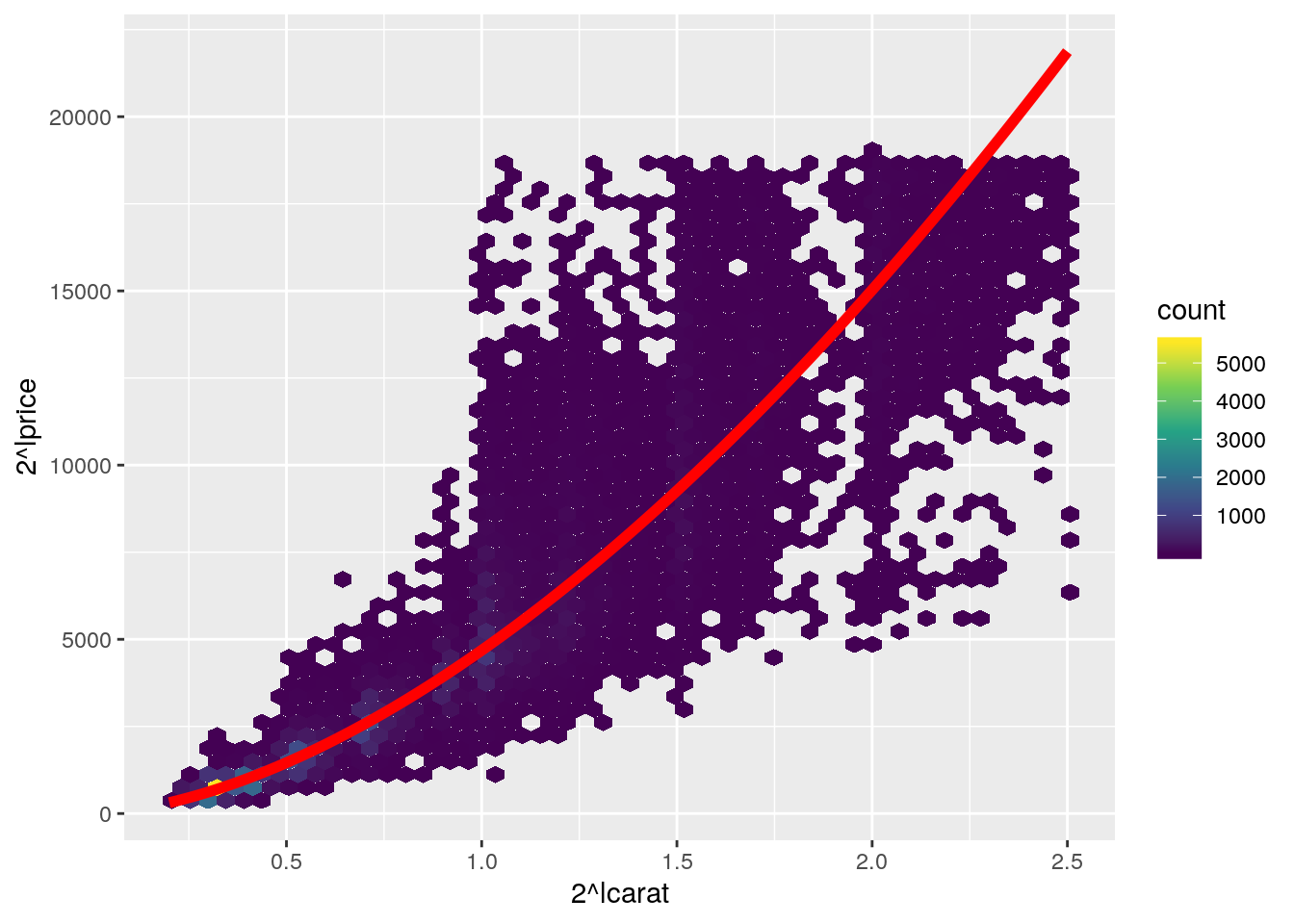
Estimating the price of diamonds
- Graphically, what would be the price of a diamond weighting 2 carats?
- Using the model, calculate the price of a diamond weighting 1.75 carats
# Two methods: using predict or explicitly coefficients...
(price_estimate <- tibble(carat = 1.75, lcarat = log2(carat)) %>%
   mutate(expected_price = 2^predict(diam_lmodel, .),
          expected_price2 = 2^(coef(diam_lmodel)[2] * lcarat + coef(diam_lmodel)[1])))
## # A tibble: 1 x 4
## carat lcarat expected_price expected_price2
## <dbl> <dbl> <dbl> <dbl>
## 1 1.75 0.807 12005. 12005.- Add the point on the previous plot
augment(diam_lmodel) %>%
  ggplot(aes(2^lcarat, 2^lprice)) +
  geom_hex(bins = 50) +
  geom_line(aes(2^lcarat, 2^.fitted), colour = "red", size = 2) +
  scale_fill_viridis_c() +
  geom_point(data = price_estimate, aes(y = expected_price), color = "green", size = 4)