TD - The mice weight dataset
Eric Koncina, A. Ginolhac
2019-11-05
This tutorial is inspired and adapted from the sthda practical guide published under the creative commons license.
Mouse weights
Download the mousew dataset from here and load it in R. This dataset contains the weight (in grams) of two strains of mice for both genders.
mousew <- read_csv("data/mousew.csv", col_types = cols(strain = col_character(),
                                                       sex = col_character(),
                                                       weight = col_double()))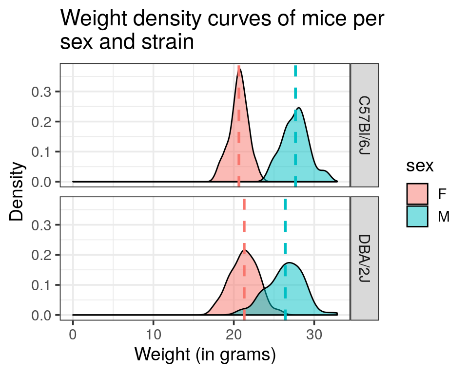
Histogram and density curve representations
- Draw a histogram of the weight distribution and adjust the range for every bar to 0.5 g.
mousew %>%
  ggplot(aes(x = weight)) +
  geom_histogram(binwidth = 0.5)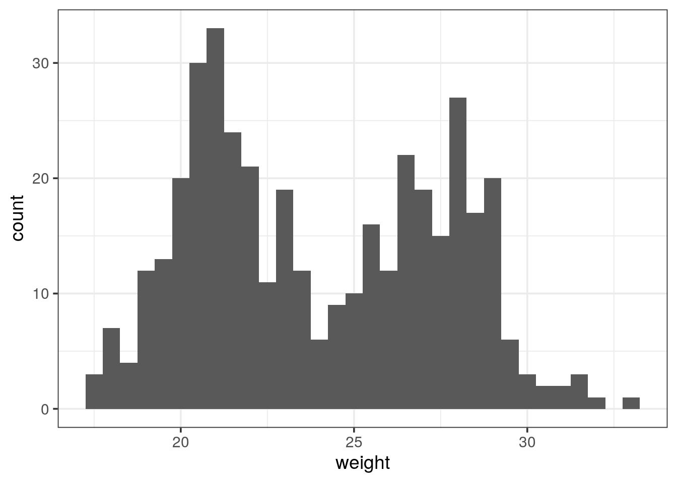
- Attribute a color to the different genders histograms
- Have a look at the overlapping region. Could you find a way to avoid the stacking of bars?
Tip
Have a look at the
position argument.
mousew %>%
  ggplot(aes(x = weight, fill = sex)) +
  geom_histogram(binwidth = 0.5, position = "identity", alpha = 0.5)
# or position = "dodge" but not very nice...- Draw a density curve of the weight for both genders.
mousew %>%
  # color for coloring the lines too
  ggplot(aes(x = weight, fill = sex, colour = sex)) +
  geom_density(alpha = 0.5)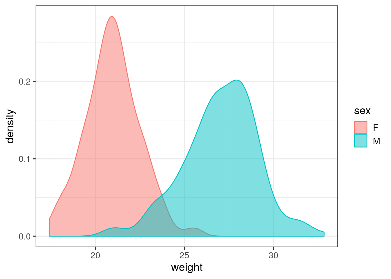
- Overlay the histogram representation to the previous plot.
mousew %>%
  ggplot(aes(x = weight, y = stat(density))) +
  geom_histogram(aes(fill = sex), alpha = 0.6, position = "identity", binwidth = 0.5) +
  geom_density(aes(color = sex))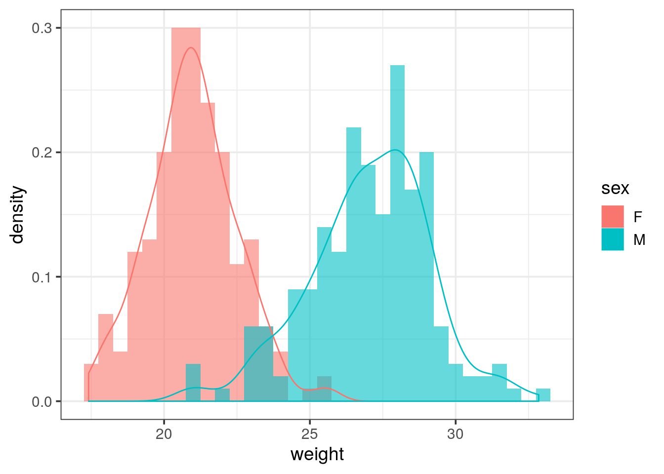
- The data frame contains the weight of 2 mouse strains: Split the plot into two separate ones for each strain and draw one above the other (in rows).
- Add a vertical dashed line representing the mean value of each group
ggplot2automatically adjusts the range of the axis. Try to override this behaviour and let the x axis start at 0- Draw each density curve of sex and mouse strain combination in a single panel.
- Try to reproduce the following plot:
- Would you recommend these settings to display the weight distributions?
Tip
remember that each
geom_* can takes its own data argument that overwrite the one inherited from the ggplot() call. Might be worth summarising by the mean the weight and a 4 rows tibble. Then pass it to geom_vline(). Of note, aesthetics are also not inherited when a new data is specified.
Tip
- to get the x axis start at 0, have a look at the
expand_limit()function - labels that recall the variable names (such as
strainandsex), see thelabellerargument offacet_wrap()
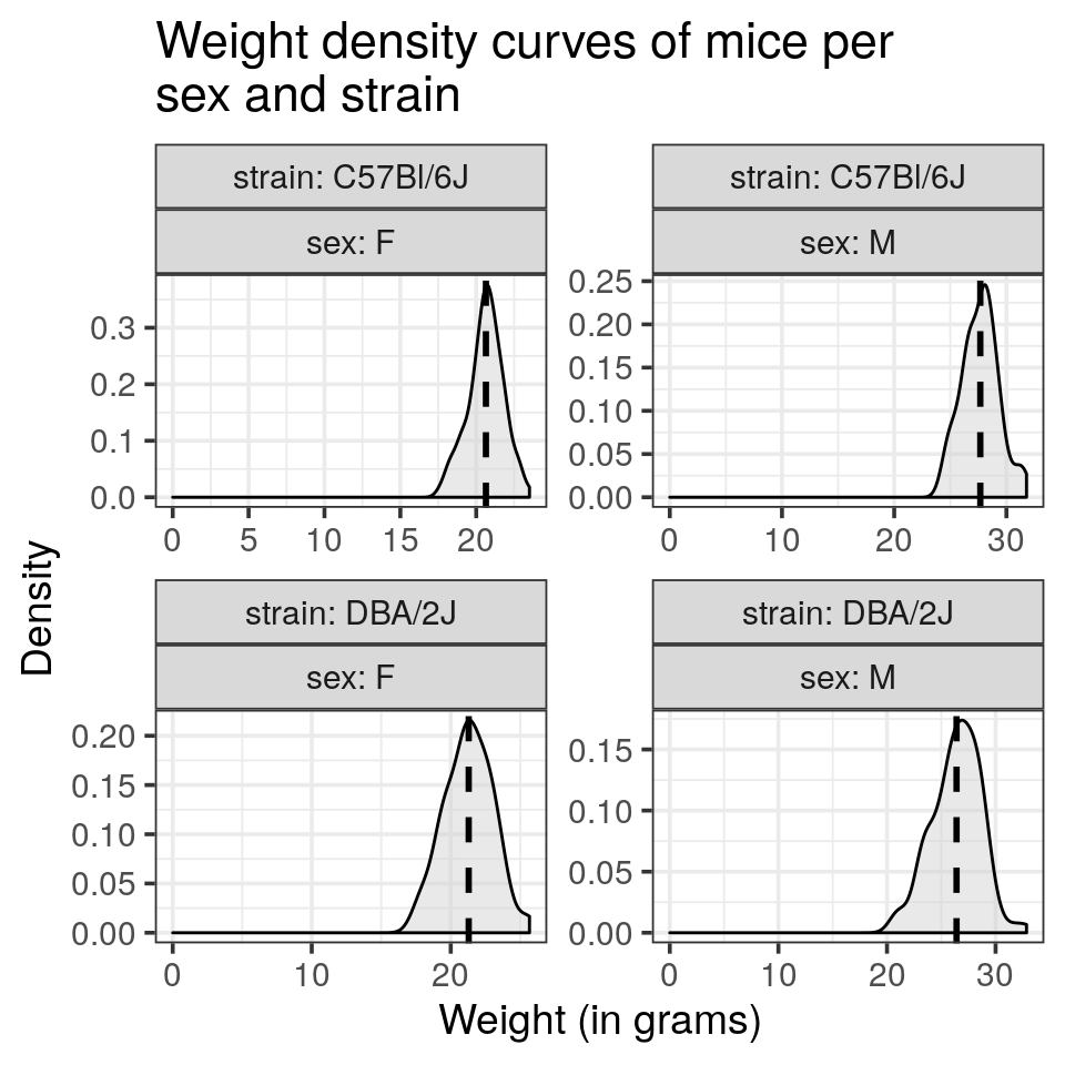
mousew_summary <- mousew %>%
  group_by(strain, sex) %>%
  summarise(median_weight = median(weight),
            mean_weight = mean(weight),
            sd_weight = sd(weight))

mousew %>%
  ggplot(aes(x = weight)) +
  geom_density(alpha = 0.5, fill = "lightgray") +
  geom_vline(data = mousew_summary, aes(xintercept = mean_weight), linetype = "dashed", size = 1, show.legend = FALSE) +
  expand_limits(x = 0) +
  facet_wrap(~ strain + sex, scales = "free") +
  labs(title = "Weight density curves of mice per\nsex and strain",
       x = "Weight (in grams)",
       y = "Density")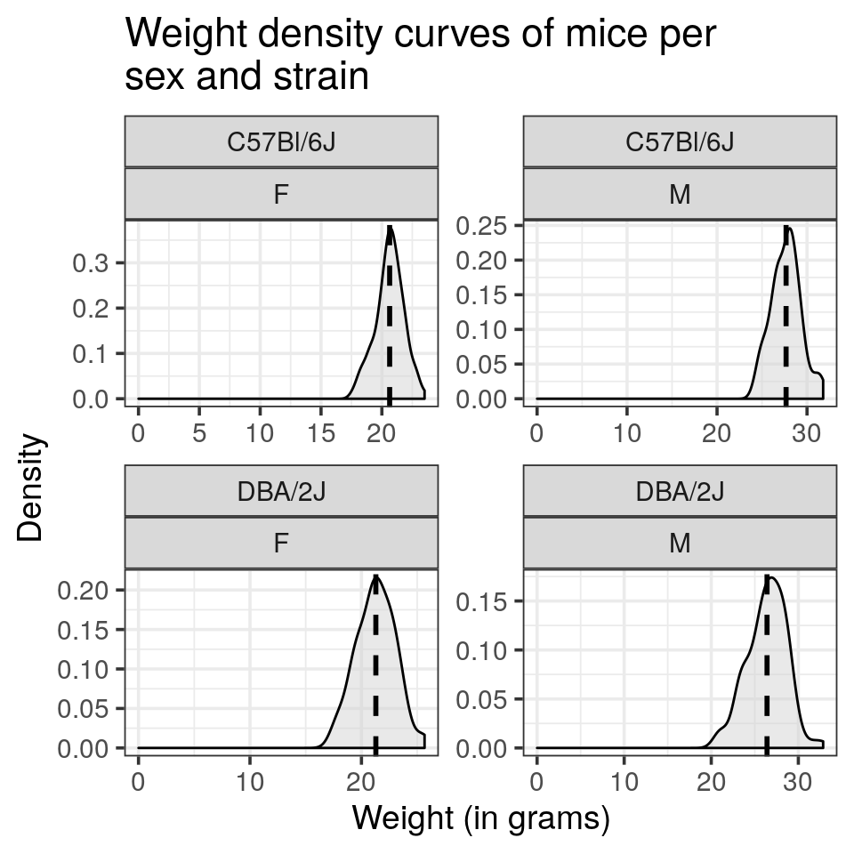
this reprensation does not allow an easy comparison of gender per strain
- draw the gender as colour and reproduce the plot displayed as introduction
mousew %>%
  ggplot(aes(x = weight, fill = sex)) +
  geom_density(alpha = 0.5) +
  geom_vline(data = mousew_summary, aes(xintercept = mean_weight, color = sex), linetype = "dashed", size = 1, show.legend = FALSE) +
  facet_grid(strain ~ .) +
  expand_limits(x = 0) +
  ggtitle("Weight density curves of mice per\nsex and strain") +
  xlab("Weight (in grams)") +
  ylab("Density")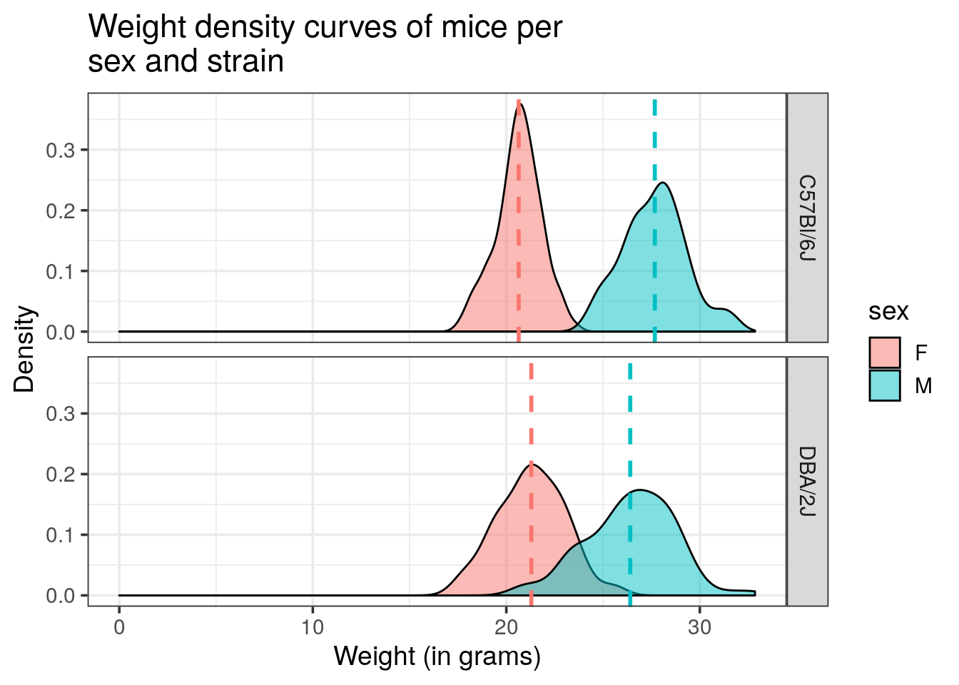
Boxplot and bar chart representations
- Draw a box plot of the weight of rodents for each sex
- use again an additional command to display the y-axis from 0.
mousew %>%
  ggplot(aes(x = sex, y = weight, fill = sex)) +
  geom_boxplot() +
  expand_limits(y = 0)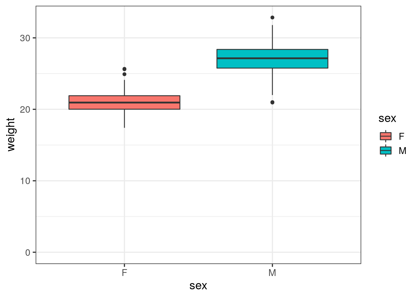
- Draw a bar chart of the weight for each sex, colored by strain
Tip
- using
geom_col()requires ayaesthetetic to map on the continuous variable - set the
alphaparamater to give some transparency, will help to spot inconsistencies
mousew %>%
  ggplot(aes(x = sex, y = weight, fill = strain), alpha = 0.5) +
  geom_col()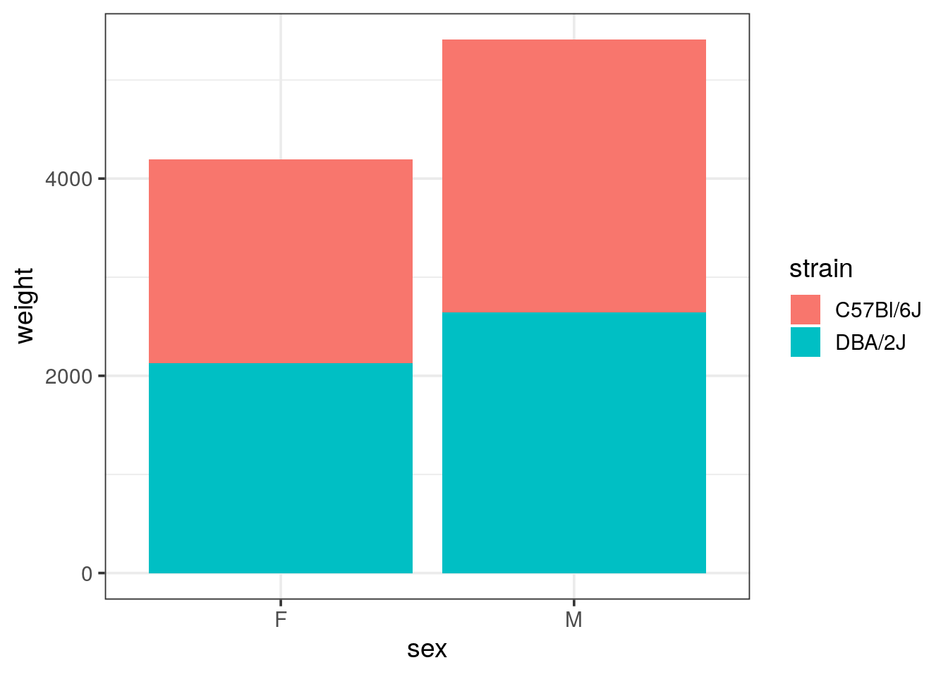
- Does it make sense?
the weight displayed is in the range of 2 to 4 tons! Looking at the limits thanks to the transparency, we see that all mice weight were summed up and stacked.
- Draw a bar chart of the summarised weight (with mean) for each sex, colored by strain
Tip
mind the
position argument for geom_col(), default is stack, alternatives are dodge (side by side) or fill for proportions
mousew %>%
  group_by(strain, sex) %>%
  summarise(mean_weight = mean(weight), sd_weight = sd(weight)) %>%
  ggplot(aes(x = sex, y = mean_weight, fill = strain)) +
  geom_col(position = "dodge")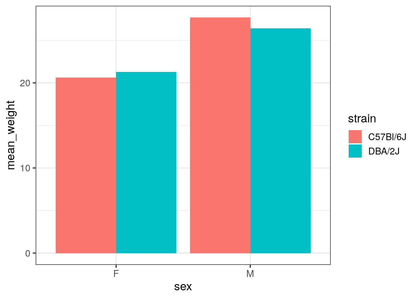
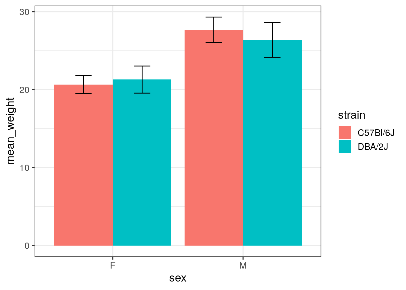
- Add error bars to your bar chart using
geom_errorbar()and using the standard deviations (sd).
Tip
- you will need to adjust the dodging for error bars.
position = "dodge"calls theposition_dodge()function. Look at the help of this function, one example is describing how to align narrower elements like error bars. - See the
widthelement ofgeom_errorbar()to reduce the default which is too large.
mousew %>%
  group_by(strain, sex) %>%
  summarise(mean_weight = mean(weight), sd_weight = sd(weight)) %>%
  ggplot(aes(x = sex, y = mean_weight, fill = strain)) +
  geom_col(position = "dodge") +
  geom_errorbar(aes(ymin = mean_weight - sd_weight, ymax = mean_weight + sd_weight),
                width = 0.25, position = position_dodge(width = 0.9))