
TD Introduction to biostatistics
Aurélien Ginolhac, Eric Koncina
2019-10-28
1. Testing for normality
We are going to use the garden data, with the measurement of ozone concentrations in 3 different areas.
Objective: the idea is to display the distribution of all three series and look at the shapes. The goal is also to learn how to plot using R and how to customize and combine plots. Eventually, the final result should look like:
## Warning in geom_abline(aes(colour = garden), intercept = 0, slope = 1, size = 1): Using `intercept` and/or `slope` with `mapping` may not have the desired result as mapping is overwritten if either of these is specified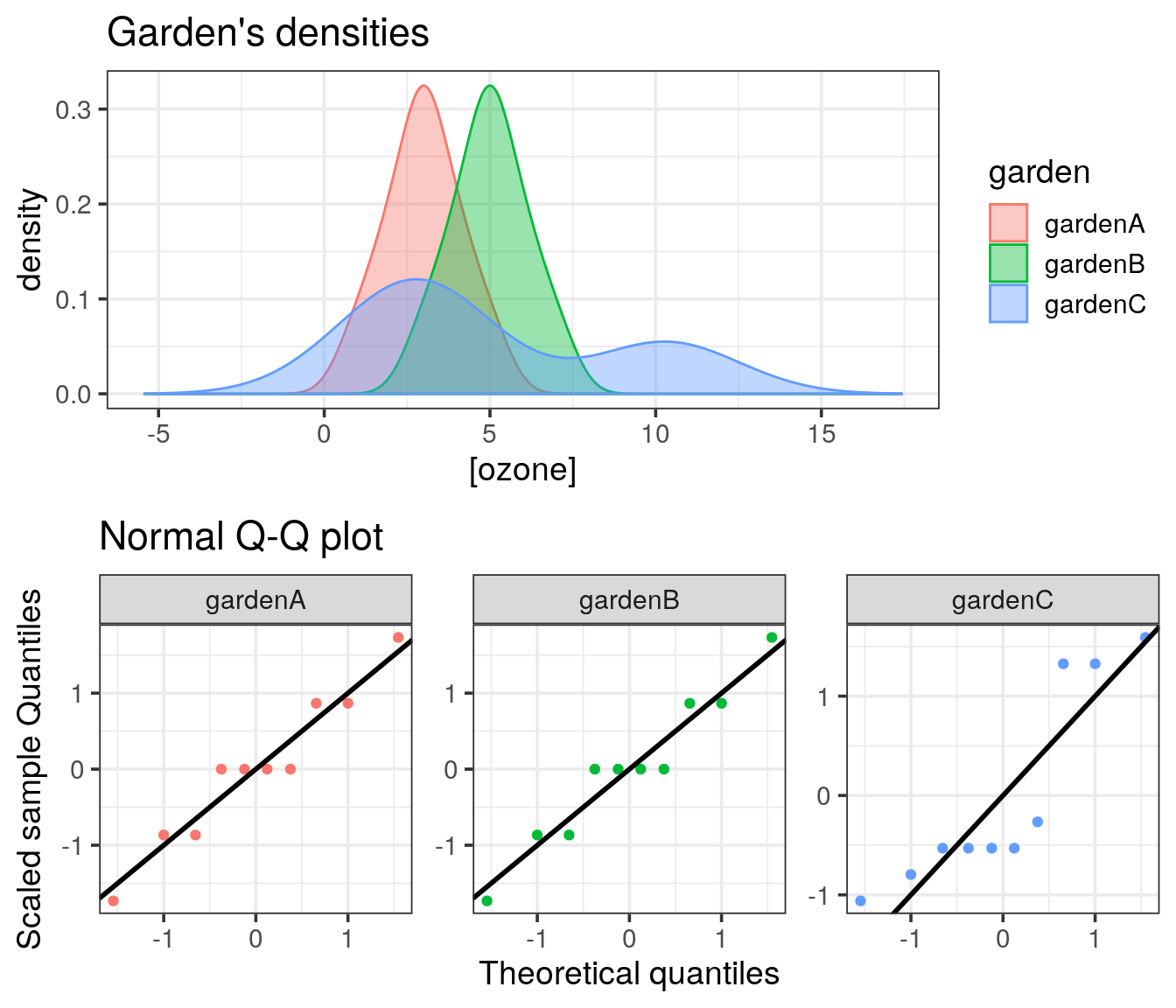
1.1 Loading the data
Download the garden dataset from this link and import it into R.
1.2 Plotting the main densities
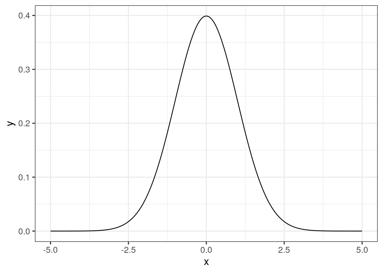
Just plotting the 10 points for each dataset won’t help much. When looking at the density distribution, one can observe the shape, if it is bell-shaped or not, and how they compare to each other. You have already learned to use the dnorm() function which produces the density of a normal distribution with a mean of 0 and a standard deviation of 1.
- Use this function to plot a serie of
xvalues in order to obtain a smooth curve (e.g. 100 values from -5 to 5).
Tip
seq() is a very neat function that you should memorize, remember to check its help page with ?seq. The argument length.out should help to have a smooth line.
Now, you would like to apply a density function to your own data.
- Draw the density plot of gardenA using
ggplot2.
Tip
geom_density provides an area while geom_line with the proper stat gives the same density curve without the area
ggplot2 centers the view around the range of our data. Try to enhance the output with expand_limits() to visualize the extrapolated curve or use the result of density() and plot it with ggplot2. See for example this output:
density(garden$gardenA)##
## Call:
## density.default(x = garden$gardenA)
##
## Data: garden$gardenA (10 obs.); Bandwidth 'bw' = 0.6357
##
## x y
## Min. :-0.907 Min. :0.0007088
## 1st Qu.: 1.047 1st Qu.:0.0227274
## Median : 3.000 Median :0.1053070
## Mean : 3.000 Mean :0.1278168
## 3rd Qu.: 4.953 3rd Qu.:0.2201552
## Max. : 6.907 Max. :0.3248826the x and y data are quantile summarised (based on the 500 data points generated by default). Each correspond to the x and y axis of the density plot respectively.
get the limits of the
xdensities per garden. Before, ask yourself if the data frame is tidy?Add the two other densities (garden B and C) to the first plot, mapping the
fillto garden’s name. Thexlimits will be the minimum and maximum for all 3 gardens. Before adding the other gardens, be sure to use a tidy data frame.
Conclusion
What can you say about the shapes of all the three empirical distributions?
1.3 Plotting Quantile-Quantile comparison to the normal distribution
A Q-Q plot allows you to see how the quantiles of two distributions fit. In our case, we want to compare each of the garden’s distribution to the normal distribution. Use the function qqnorm() and add the ideal line with qqline(). When the dots are close to the plain line, then the distribution follows the normal one.
Try to draw the Q-Q plot with ggplot. The stat_qq() function provided by ggplot might be helpful, by default it uses the normal distribution.
To enhance the way of drawing a Q-Q plot:
- scale the ozone concentration for each garden
- plot the scaled sample quantiles against the theoretical quantiles (
stat_qq). - add the line \(y=x\) (
geom_abline).
Tip
the function scale() allows to center a distribution as z-scores:
- mean centered on 0
- standard deviation of 1
1.4 Plotting all together
Return to your density ggplot and store it in a variable called p1. Similarly store your Q-Q plot (ggplot version) in the variable p2. To combine both plots into a single one, try to use the plot_grid() function provided by the cowplot package.
1.6 Statistical tests to assess normality
Use the Shapiro test for the three datasets, using \(\alpha=0.05\).
- What can you conclude about these 3 distributions?
- Are they following the normal distribution?
- Does it fit your visual expectations?
2 Compare two samples
We are now going to use the wings dataset, which you can download here. This dataset contains the measurement of wing length in insects living in 2 different areas.
Objective: Compare both locations and determine if the insects have different sizes of wings. By difference, we mean testing several components of what defines a distribution.
2.1 Loading the data
Load the
wingsdataset that contains the insect wing length measured in two different locations.What are the variables? Are they continuous or discrete?
2.2 How many observations per location
Before doing anything, we would like to have an idea of how much data we are dealing with: globally and per location. How many observations do we have per location?
2.3 Plotting densities
First, once we have a new dataset, it is often useful to represent it graphically to get an idea on how it looks like.
Draw two plots on the same page (one above the other):
the two densities with their respective means as vertical dashed lines with the corresponding colors.
a boxplot of the sizes in both locations.
Do the means appear different? What about the medians?
2.4 Compare the two means
Before comparing the two means, we need to ensure that both distributions are normal in order to determine which test we should use.
- Which test should be used to test the normality? Are A and B following a normal distribution?
Tip
- Try to stick to the tidyverse way of doing and use
tibbles. Think about setting a grouping variable and nest the tibble. - To apply your test to a subset, define a new column using mutate and use the function
map()from thepurrrpackage (you will learn to use the function in more detail in a couple of weeks) to map your statistical function to each subset. - Finally, use the
tidy()function from thebroompackage to get a nice output.
To compare two means, what test should we use if 1. is true? or false?
test if the variances are different between the 2 locations? What is the consequence for the test chosen in 2?
Define \(H_0\) for the appropriate test, and then the alternative hypothesis \(H_1\).
Perform the test using the built-in R function and conclude
Tip
data of the t test function allows you to use non-standard evaluation of the column of interest