
TD - plotting with ggplot2
A. Ginolhac
2019-10-15
This practical aims at performing exploratory plots and how-to build layer by layer to be familiar with the grammar of graphics. In the last part, a supplementary exercise will focus on plotting genome-wide CNV. You will also learn to use the
forcatspackage which allows you to adjust the ordering of categorical variables appearing on your plot.
Scatter plots
The mtcars dataset is provided by the ggplot2 library (have a look above at the first lines printed using the head() function). As for every (or near to every) function, most datasets shipped with a library contain also a useful help page (?).
- Plot the fuel consumption on the y axis and the cars weight on the x axis.
mtcars %>%
  ggplot(aes(x = wt, y = mpg)) +
  geom_point()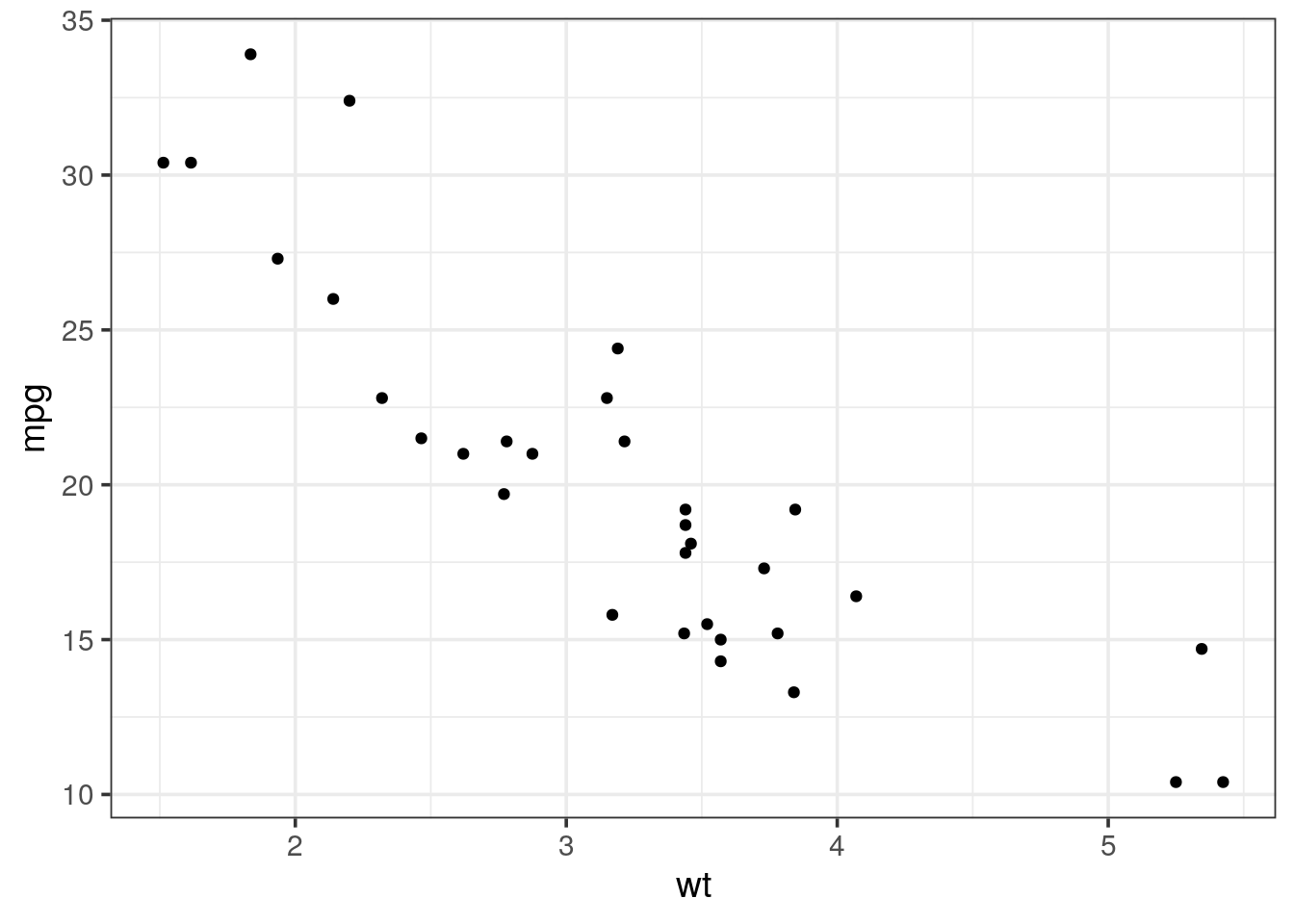
- The
geom_smooth()layer can be used to add a trend line. Try to overlay it to your scatter plot.
Tip
by default geom_smooth is using a loess regression (< 1,000 points) and adds standard error intervals.
- The
methodargument can be used to change the regression to a linear one:method = "lm" - to disable the ribbon of standard errors, set
se = FALSE
mtcars %>%
  ggplot(aes(x = wt, y = mpg)) +
  geom_point() +
  geom_smooth()
## `geom_smooth()` using method = 'loess' and formula 'y ~ x'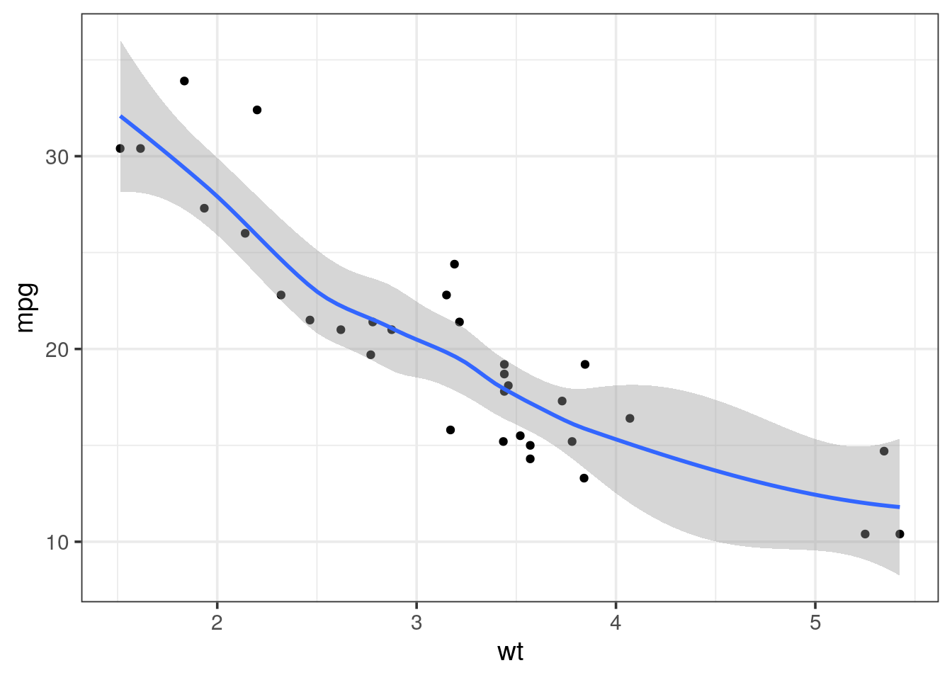
- It would be more useful to draw a regression line on the scatter plot and without the standard error. Using the help (
?), adjust the relevant setting ingeom_smooth().
mtcars %>%
  ggplot(aes(x = wt, y = mpg)) +
  geom_point() +
  geom_smooth(method = "lm", se = FALSE)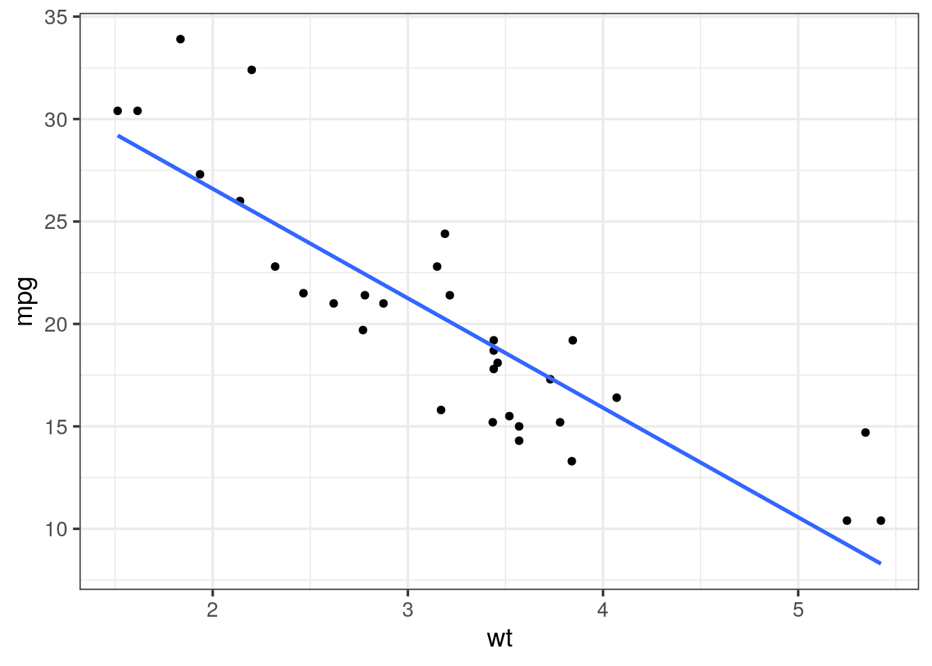
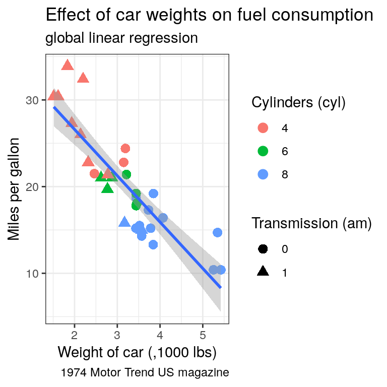
- Ajust some aesthetics in order to:
- associate the shape of the points to the number of cylinders
- associate a colour gradient to the quarter mile time (i.e
qseq) - If you’re feeling succesful, try to adjust the colour gradient from yellow for fast accelerating cars to blue for slow accelerating cars.
- have a look at the R package viridis which provides palettes color-blind friendly and suitable for grey printing
Tip
cyl variable is of type double, thus a continuous variable. To map as the shape aesthetics, mind coercing the variable to a factor using factor(cyl)
mtcars %>%
  ggplot(aes(x = wt, y = mpg, color = qsec)) +
  geom_point(aes(shape = factor(cyl)), size = 3) +
  geom_smooth(method = "lm", se = FALSE) +
  scale_colour_continuous(low = "yellow", high = "blue") +
  theme_bw()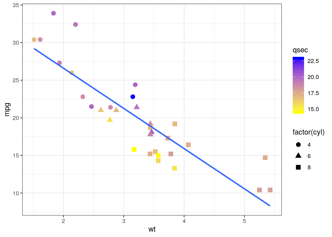
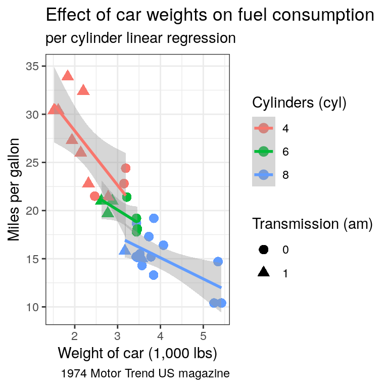
- Ajust the colour aesthetic to the
ggplot()call to propagate it to both point and regression line. Try the scale colour viridis for discrete scale (scale_colour_viridis_d())
mtcars %>%
  ggplot(aes(x = wt, y = mpg, color = factor(cyl))) +
  geom_point(
    size = 3) +
  geom_smooth(method = "lm") +
  scale_colour_viridis_d() +
  theme_bw()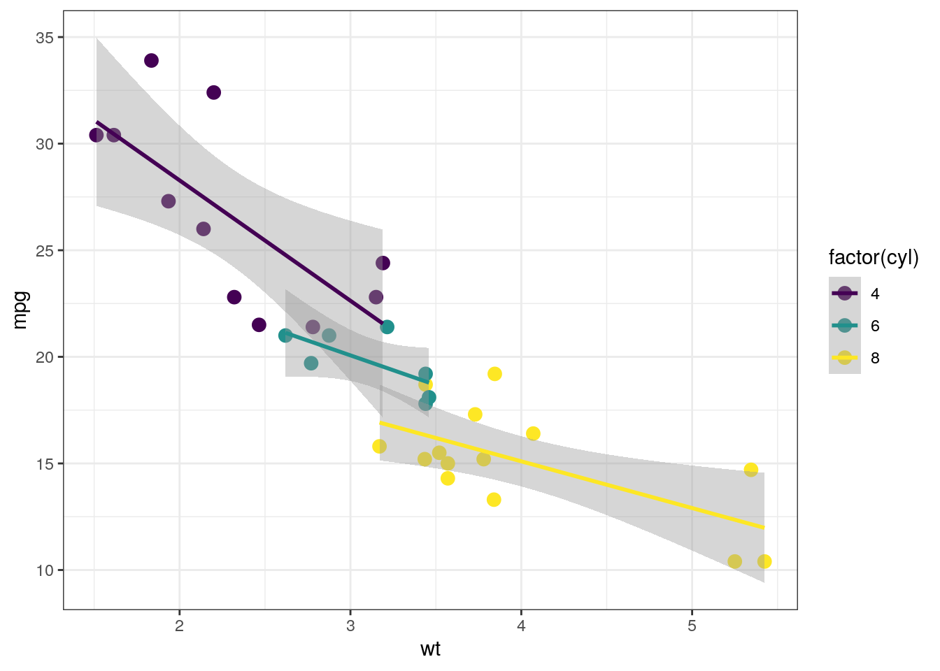
- Find a way to produce both of the following plots:
Tip
Remember that:
- all aesthetics defined in the
ggplot(aes())command will be inherited by all following layers aes()of individual geoms are specific (and overwrite the global definition if present).
Categorical data
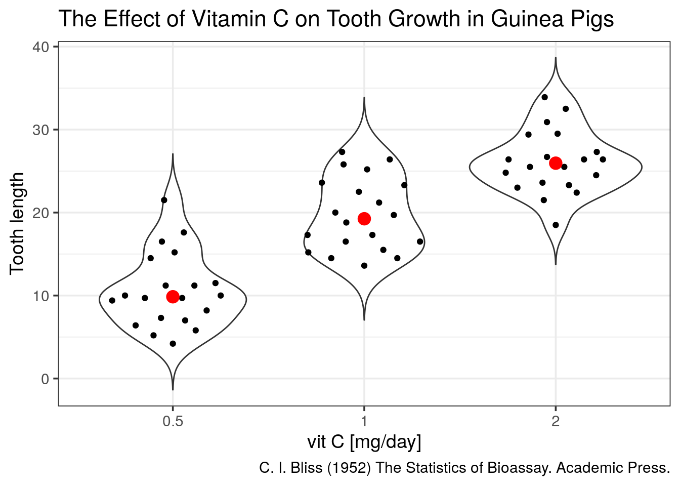
We will now look at another built-in dataset called ToothGrowth. This dataset contains the teeth length of 60 guinea pigs which received 3 different doses of vitamin C (in mg/day), delivered either by orange juice (OJ) or ascorbic acid (VC).
- Is this dataset tidy?
- plot the distributions as boxplots of the teeth lengths by the dose received
ToothGrowth %>%
  ggplot(aes(x = factor(dose), y = len)) +
  geom_boxplot()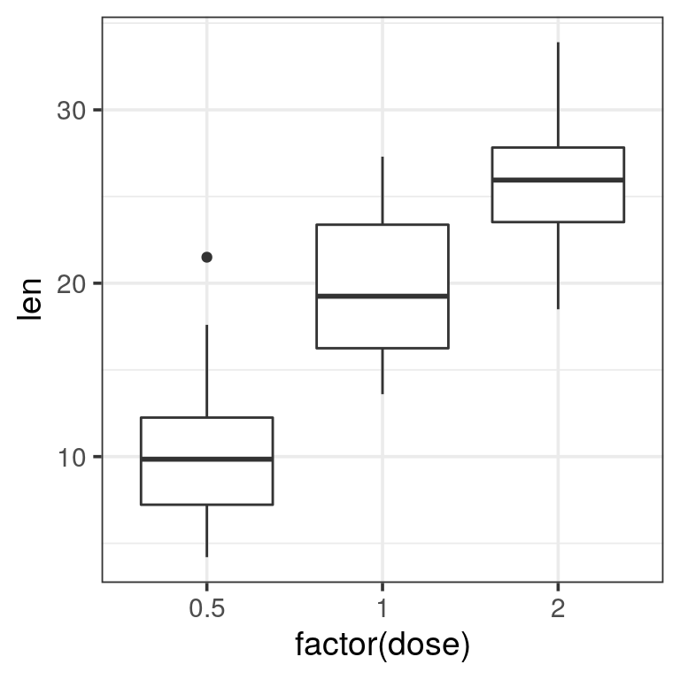
- attribute a different filling colour to each delivery method
ToothGrowth %>%
  ggplot(aes(x = factor(dose), y = len, fill = supp)) +
  geom_boxplot()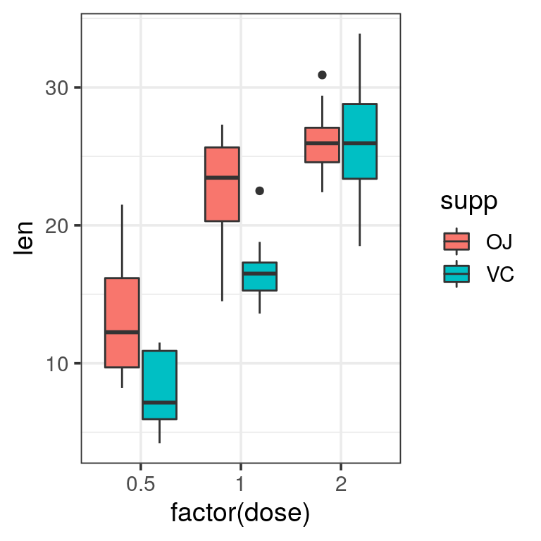
When the dataset is tidy, it is easy to draw a plot telling us the story: vitamin C affects the teeth growth and the delivery method is only important for lower concentrations.
Boxplots are nice but misleading. The size of the dataset is not visible and the shapes of distrubutions could be better represented.
- plot again length of the teeth by the received dose but using
geom_dotplot()
Tip
change the following options in geom_dotplot():
binaxis = "y"for the y-axisstackdir = "center"binwidth = 1for no binning, display all dots
ToothGrowth %>%
  ggplot(aes(x = factor(dose), y = len)) +
  geom_dotplot(binaxis = "y", stackdir = "center", binwidth = 1)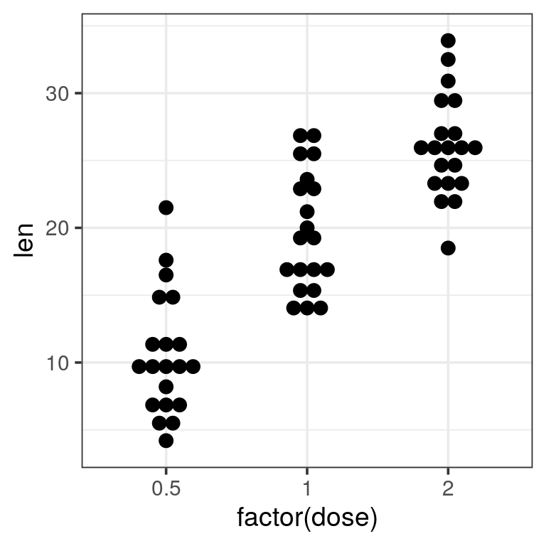
- add a
geom_violin()to the previous plot to get a better view of the distribution shape.
Tip
trim = FALSE to the violin for a better looking shape
ToothGrowth %>%
  ggplot(aes(x = factor(dose), y = len)) +
  geom_violin(trim = FALSE) +
  geom_dotplot(binaxis = "y", stackdir = "center", binwidth = 1)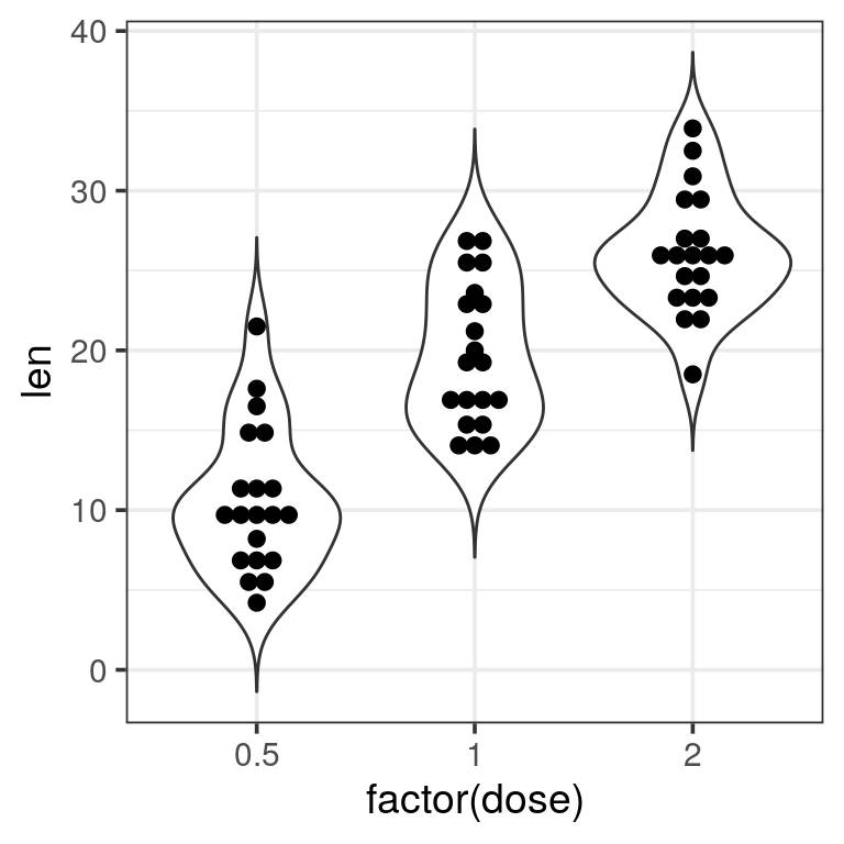
Now we are missing summary values like the median which is shown by the boxplots. We should add one.
- add the median using
geom_point(stat = "summary")to the previous plot
- add the median using
Tip
fun.y = "median" and appropriate size, colour to get a big red dot.
ToothGrowth %>%
  ggplot(aes(x = factor(dose), y = len)) +
  geom_violin(trim = FALSE) +
  geom_dotplot(binaxis = "y", stackdir = "center", binwidth = 1) +
  geom_point(stat = "summary", fun.y = "median", colour = "red", size = 4) +
  labs(x = "vit C [mg/day]",
       y = "Tooth length",
       title = "The Effect of Vitamin C on Tooth Growth in Guinea Pigs",
       caption = "C. I. Bliss (1952) The Statistics of Bioassay. Academic Press.")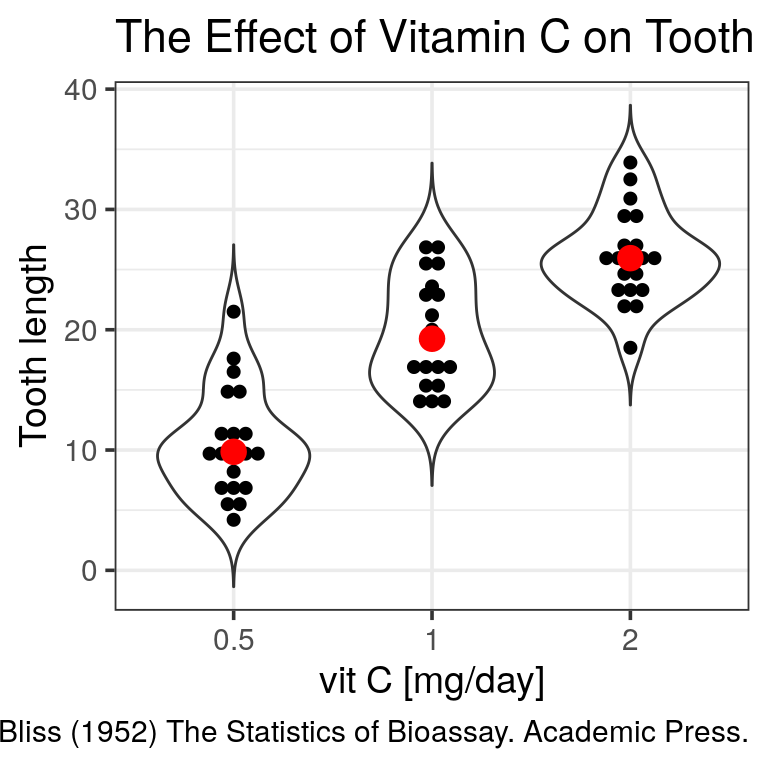
Of note, a ggplot extension named ggbeeswarm proposes a very neat dotplot that fits the distribution.
Supplementary exercises: genome-wide copy number variants (CNV) detection
Let’s have a look at a real output file for CNV detection. The used tool is called Reference Coverage Profiles: RCP. It was developed by analyzing the depth of coverage in over 6000 high quality (>40×) genomes. In the end, for every kb a state is assigned and similar states are merged eventually.
state means:
- 0, no coverage
- 1, deletion
- 2, expected diploidy
- 3, duplication
- 4, > 3 copies
Reading data
The file is accessible here. readr can even read the file directly from the website so you don’t need to download it locally.
CNV.seg has 5 columns and the first 10 lines look like:
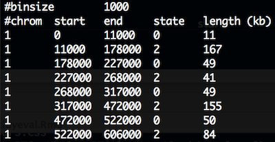
CNV
- load the file
CNV.segin R.
Warning
several issues must be fixed:
- comment should be discarded.
- chromosome will be read as integers since first 1000 lines are 1. But, X, Y are at the file’s end.
- first and last column names are unclean.
#chromcomtains a hash andlength (kb). Would be neater to fix this upfront.
cnv <- read_tsv("data/CNV.seg", skip = 2,
                col_names = c("chr", "start", "end", "state", "length_kb"),
                col_types = cols(chr = col_character()))
cnv
## # A tibble: 19,288 x 5
## chr start end state length_kb
## <chr> <dbl> <dbl> <dbl> <dbl>
## 1 1 0 11000 0 11
## 2 1 11000 178000 2 167
## 3 1 178000 227000 0 49
## 4 1 227000 268000 2 41
## 5 1 268000 317000 0 49
## 6 1 317000 472000 2 155
## 7 1 472000 522000 0 50
## 8 1 522000 606000 2 84
## 9 1 606000 609000 0 3
## 10 1 609000 611000 2 2
## # … with 19,278 more rowsexploratory plots
- plot the counts of the different states. We expect a majority of diploid states.
cnv %>%
  ggplot(aes(x = state)) +
  geom_bar()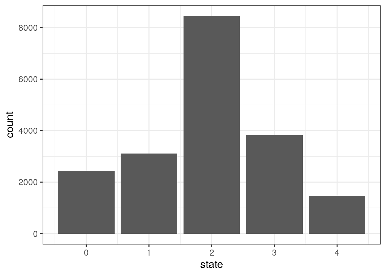
- plot the counts of the different states per chromosome. Might be worth freeing the count scale.
cnv %>%
  ggplot(aes(x = state)) +
  geom_bar() +
  facet_wrap(~ chr, scales = "free_y")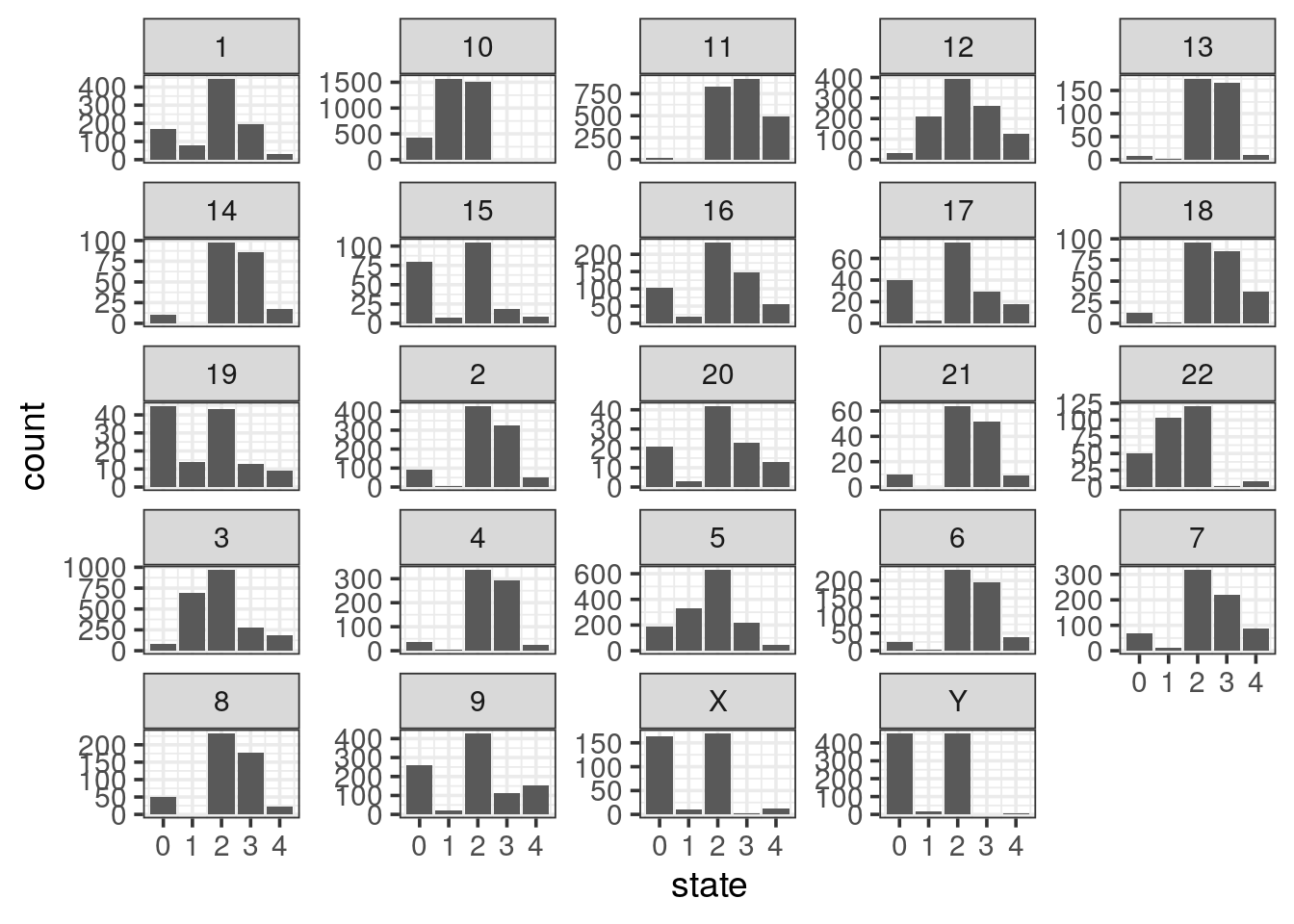
- using the previous plot, reorder the levels of chromosomes to let them appear in the karyotype order (1:22, X, Y)
Tip
fct_inorder() function in the forcats package to take advantage of this.
cnv %>%
  mutate(chr = fct_inorder(chr)) %>%
  ggplot(aes(x = state)) +
  geom_bar() +
  facet_wrap(~ chr, scales = "free_y")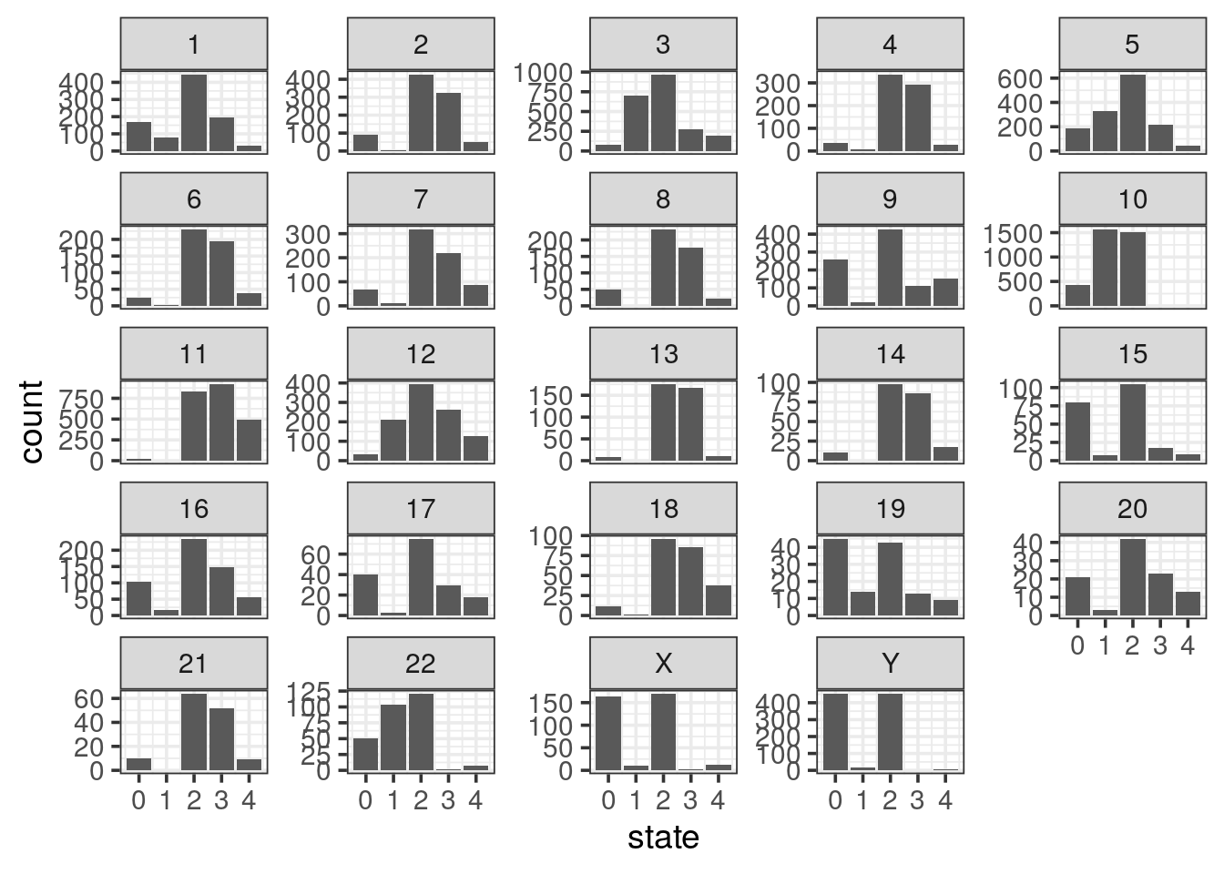
- sexual chromosomes are not informative, collapse them into a gonosomes level
Tip
fct_collapse() function in the forcats
cnv %>%
  mutate(chr = fct_inorder(chr),
         chr = fct_collapse(chr,
                            gonosomes = c("X", "Y"))) %>%
  ggplot(aes(x = state)) +
  geom_bar() +
  facet_wrap(~ chr, scales = "free_y")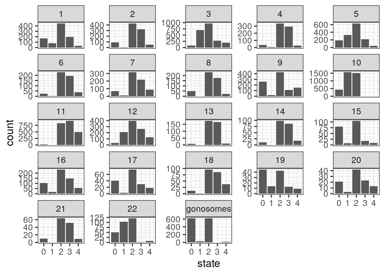
- plot the genomic segments length per state
Tip
- The distributions are completely skewed: transform to log-scale to get a decent plot.
- Add the summary mean with a red dot and median with a purple dot using the ToothGrowth example
cnv %>%
  ggplot(aes(x = factor(state), y = log10(length_kb))) +
  geom_violin() +
  geom_point(stat = "summary", fun.y = "mean", colour = "red", size = 4) +
  geom_point(stat = "summary", fun.y = "median", colour = "purple", size = 4)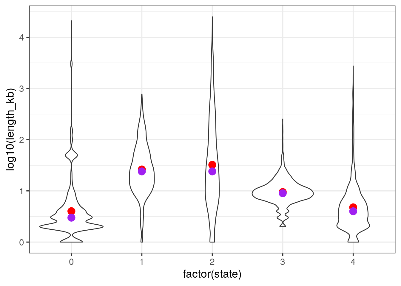
count gain / loss summarising events per chromosome
- filter the tibble only for autosomes and remove segments with no coverage and diploid (i.e states 0 and 2 respectively). Save as
cnv_auto.
cnv_auto <- cnv %>%
  filter(state == 1 | state > 2,
!chr %in% c("X", "Y"))- We are left with state 1 and 3 and 4. Rename 1 as loss and the others as gain
- count the events per chromosome and per state
- for loss counts, set them to negative so the barplot will be display up / down. Save as
cnv_auto_chr
cnv_auto %>%
  mutate(state = if_else(state == 1, "loss", "gain")) %>%
  mutate(chr = fct_inorder(chr)) %>%
  count(chr, state) %>%
mutate(n = if_else(state == "loss", -n, n)) -> cnv_auto_chr- plot
cnv_auto_chrusing the count as theyvariable.
cnv_auto_chr %>%
  ggplot(aes(x = chr, fill = state, y = n)) +
  geom_col() +
  scale_y_continuous(labels = abs) + # absolute values for negative counts
  scale_x_discrete(expand = c(0, 0)) +
  scale_fill_manual(values = c("springgreen3", "steelblue2")) +
  theme_classic(14) +
  theme(legend.position = c(1, 1),
        legend.justification = c(1, 1)) +
    labs(x = NULL,
         y = "count")
this is the final plot, where the following changes were made:
- labels of the
yaxis in absolute numbers - set
expand = c(0, 0)on thexaxis. see stackoverflow’s answer - use
theme_classic() - set the legend on the top right corner. Use a mix of
legend.positionandlegend.justificationin atheme()call. - remove the label of the
xaxis, you could use chromosomes if you prefer - change the color of the fill argument with
c("springgreen3", "steelblue2")
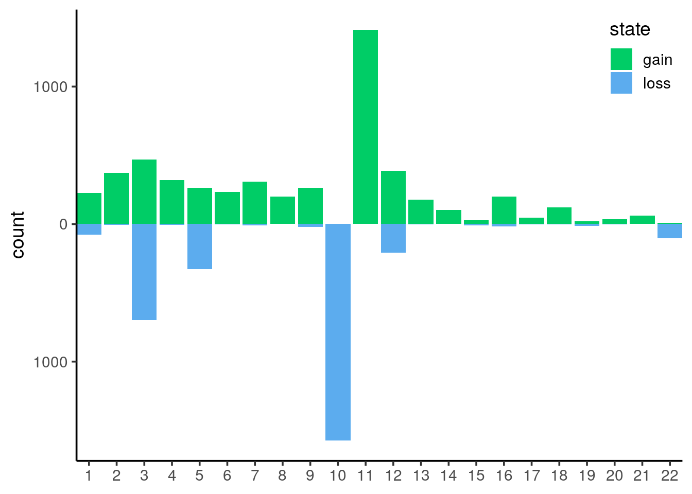
It is now obvious that we have mainly huge deletions on chromosome 10 and amplifications on chromosome 11.
In order to plot the genomic localisations of these events, we want to focus on the main chromosomes that were affected by amplifications/deletions.
- lump the chromsomes by the number of CNV events (states 1, 3 or 4) keeping the 5 top ones and plot the counts
Tip
fct_lump from forcats ease lumping. Just pick n = 5 to get the top 5 chromosomes
cnv_auto %>%
  mutate(top_chr = forcats::fct_lump(chr, n = 5)) %>%
  ggplot(aes(x = top_chr)) +
  geom_bar()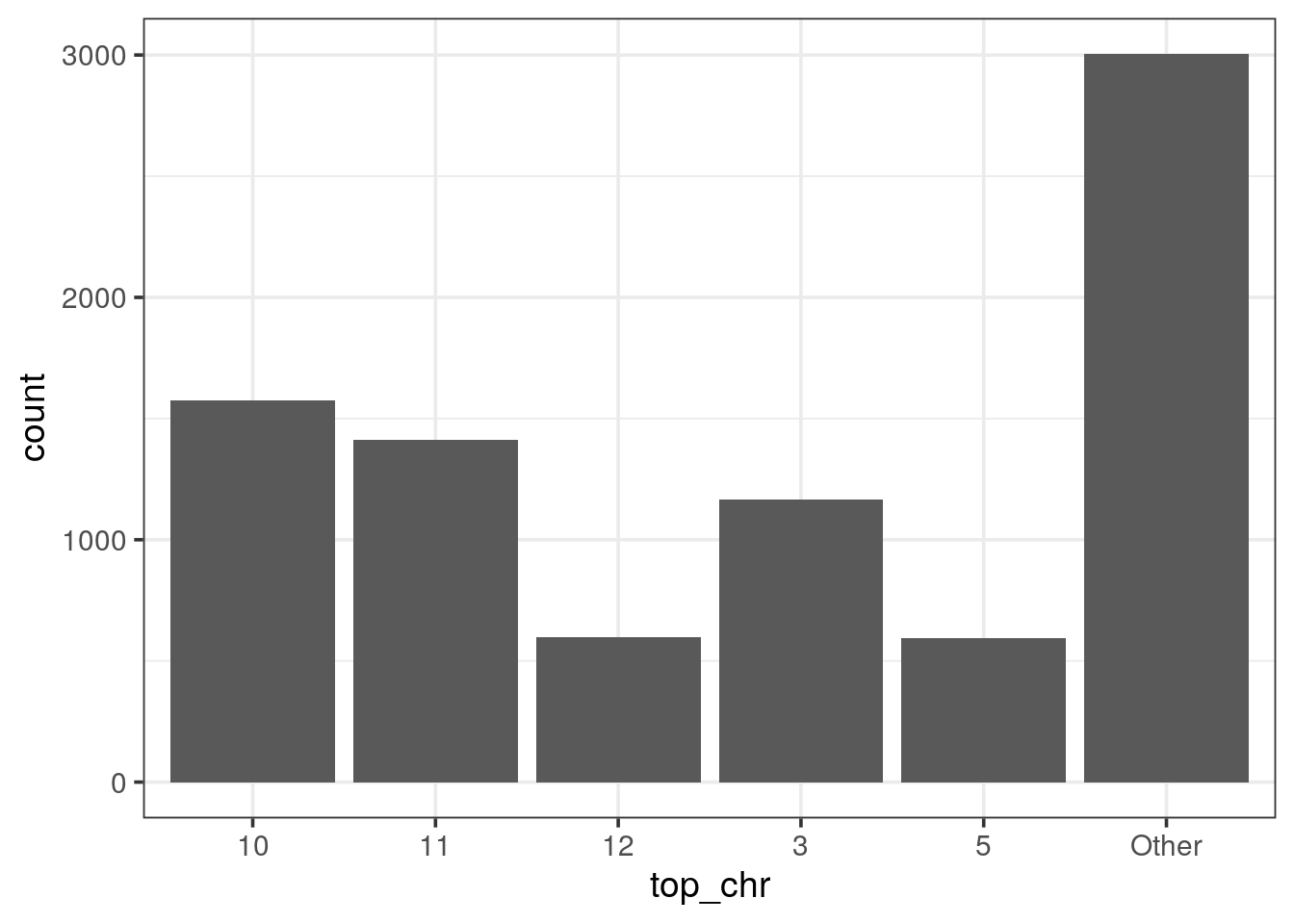
genomic plot of top 5 chromosomes
- plot the genomic localisations of CNV on the 5 main chromosomes
cnv_auto %>%
  filter(chr %in% c("10", "11", "3", "12", "5")) %>%
  mutate(cnv = if_else(state == 1, "loss", "gain"),
         state_start = if_else(state == 1, 1, 3),
         state_end   = if_else(state == 1, 1.5, 2.5)) %>%
  ggplot(aes(x = start, xend = end,
             y = state_start, yend = state_end, colour = cnv)) +
  scale_x_continuous(expand = c(0, 0),
                     breaks = seq(0, 200e6, 50e6), labels = c(1, seq(50, 200, 50))) +
  theme_classic(14) +
  theme(axis.text.y = element_blank(),
        axis.ticks.y = element_blank(),
        legend.position = c(1, 0),
        legend.justification = c(1, 0)) +
  geom_segment() +
  scale_colour_manual(name = "CNV", values = c("springgreen3", "steelblue2")) +
  facet_grid(chr ~ ., switch = "y") +
  labs(y = "Chromosome",
       colour = "state",
       x = "Genomic positions (Mb)")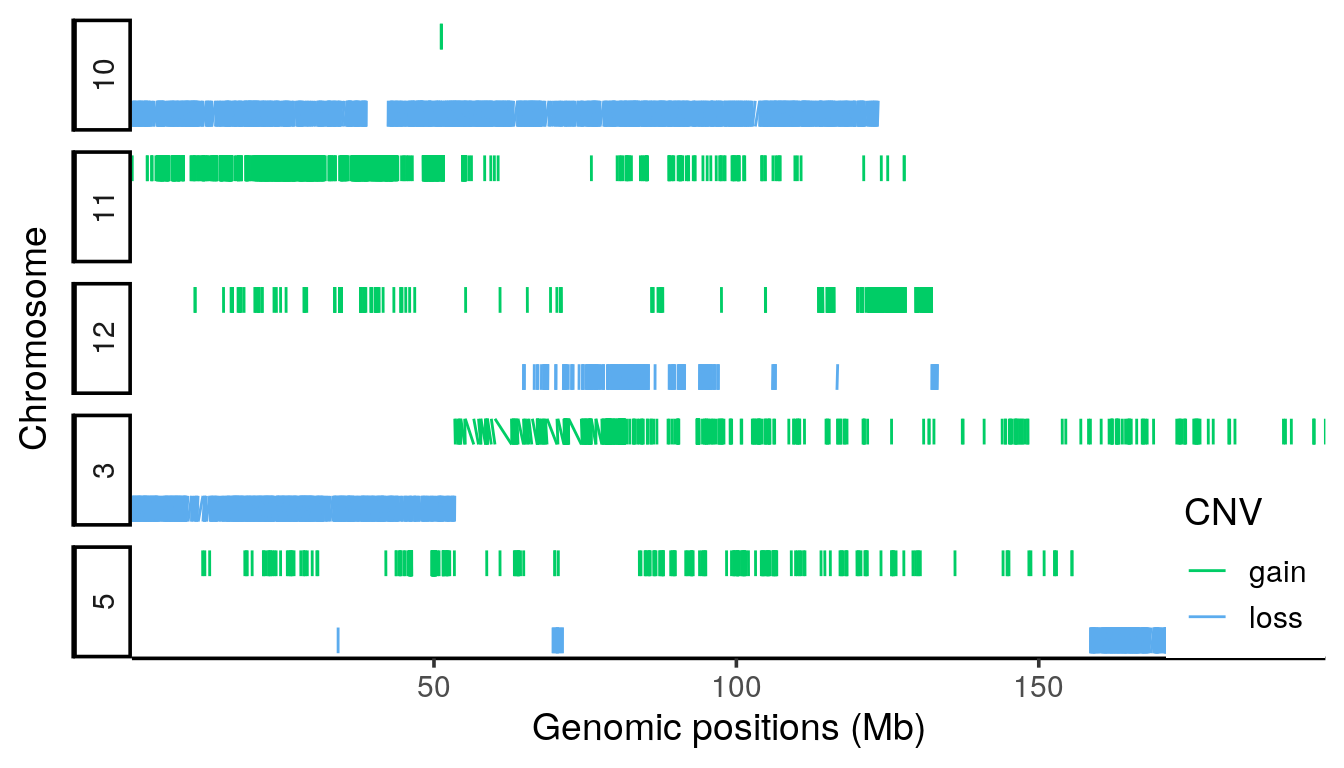
- facet_grid is used to display the chromosome horizontally. Switching the labels allow to get the strip text on the left side.
- on the x axis, using the continuous scale, manual breaks can be defined with respective labels such as Mega-bases.